digidok logo


EN
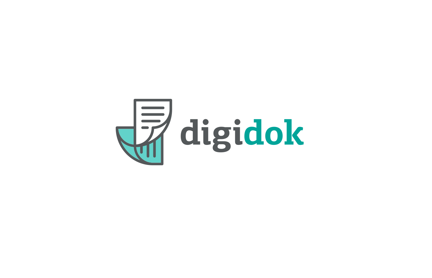
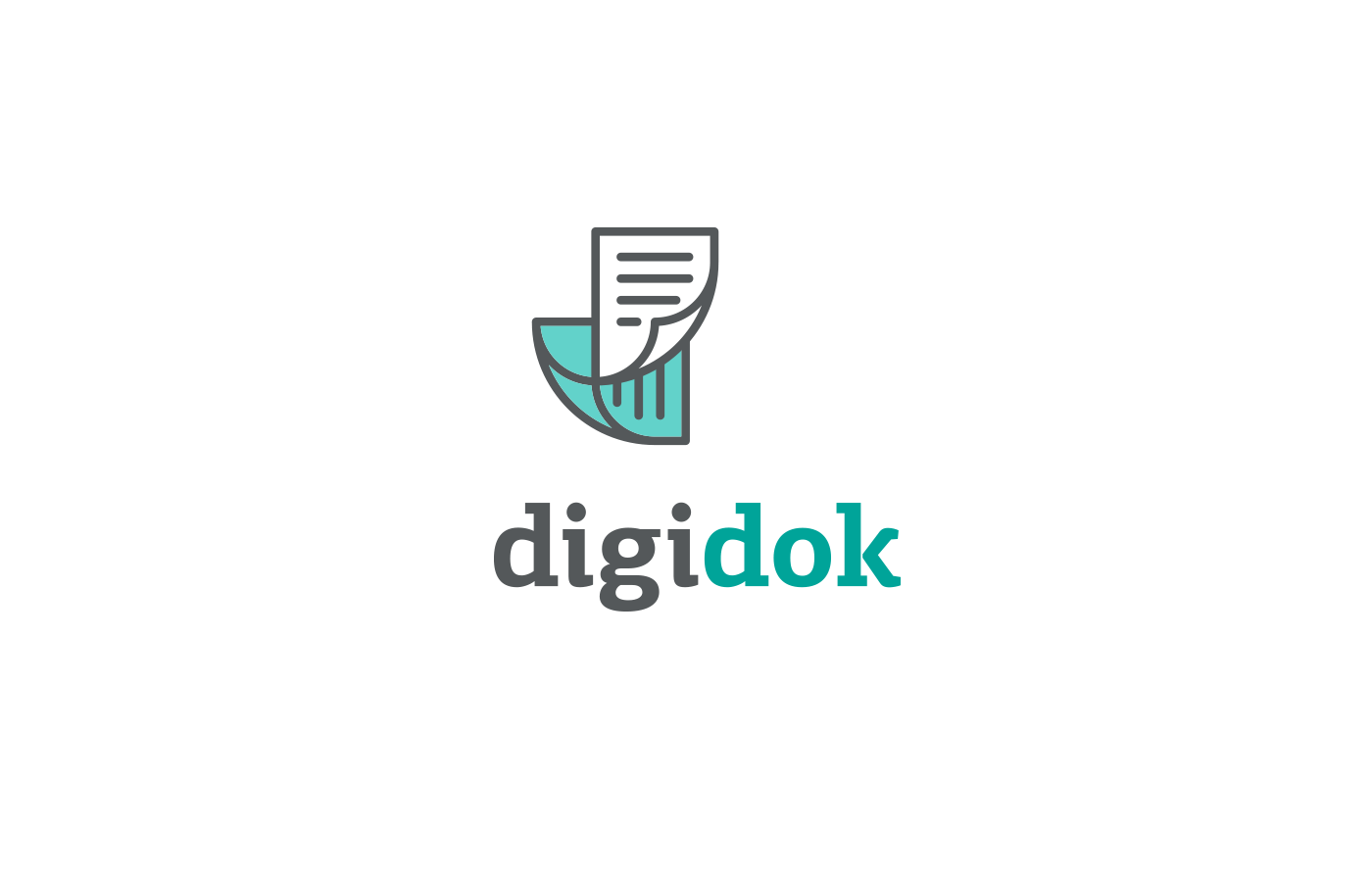
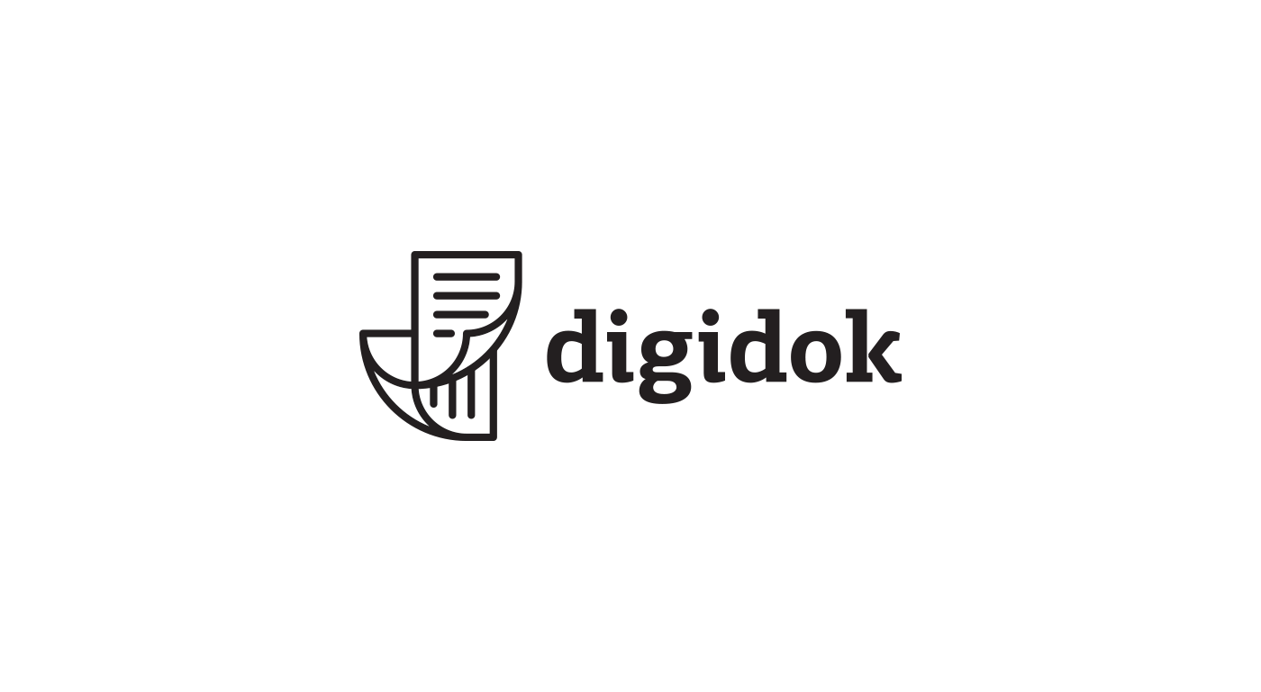
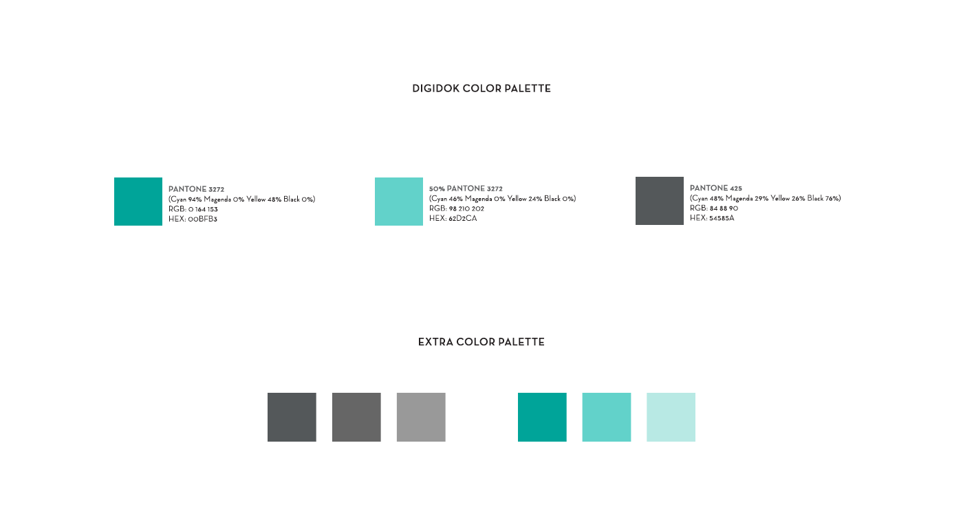
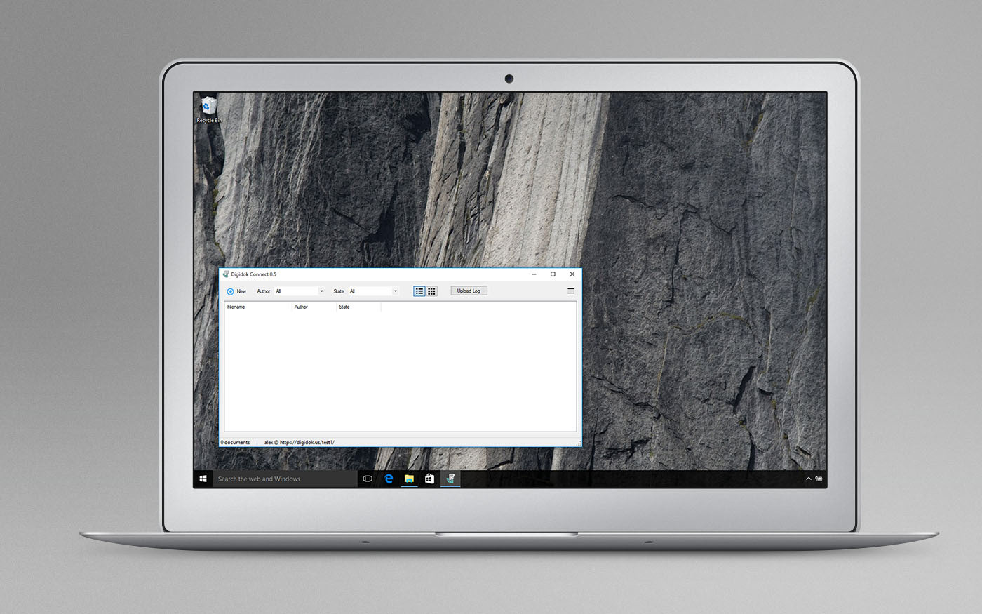
Logo design for digidok a software by Spaceport Imaging. The software helps companies and organisations to scan documents in great speed and save them in libraries so they can be browsed with ease. The software is mostly used by medical institutions (that explains the medical green we used) and by the public sector in the US, such as courts, the IRS or the Police Department. We decided to use the two letters of Digi (digital) and Dok (document) that have the form of a document/paper sheet. Then combined together they form a new lowercase "d". The new symbol should work in small sizes such as 16px.
GR
Σχεδιασμός λογότυπου για την SpacePort Imaging, και το digidok, ένα λογισμικό το οποιό βοηθάει εταιρείες και οργανισμούς να σκανάρουν με μεγάλη ταχύτητα πολλά έγραφα και να τα αποθηκεύσουν σε βιβλιοθήκες, ωστε να μπορούν να κρατούν αρχείο. Το λογισμικό απευθύνεται κυρίως νοσοκομεία στις ΗΠΑ (εξ’ ου και η επιλογή του 2ου χρώματος) ή άλλες δημοσίες υπηρεσίες (δικαστήρια, εφορίες, αστυνομία). Επιλέξαμε να κρατήσουμε τα δύο αρχικά «D» από το digital και το document, τα οποία σχεδιάσαμε σαν να ειναι έγραφα και τα οποία σχηματίζουν ένα μικρό «d». Το σύμβολο έπρεπε να λειτουργεί και σε πολύ μικρές διάστασεις (16px).