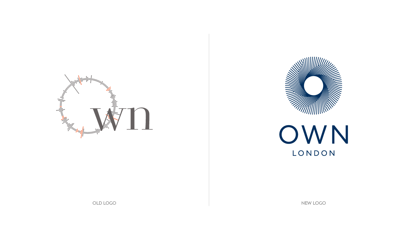
Logo redesign for OWN London
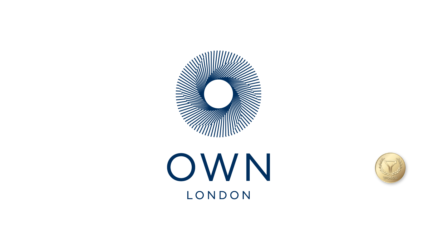
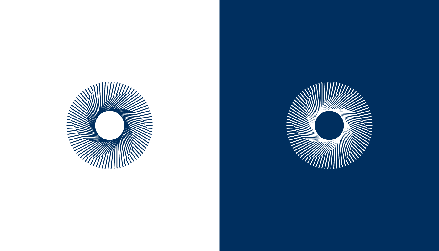
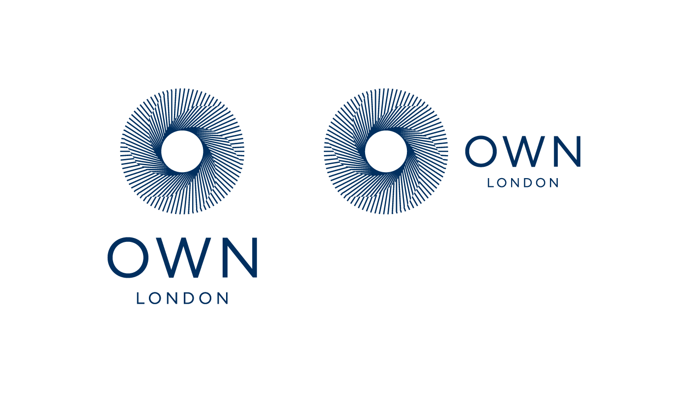
An architecture, construction and development company based in London. The new symbol is based on the a hidden hexagon that relates to the 3 pillars of the company and the 3 dimensions. The designed is based on the capital “O” and it’s also combined with a Möbius strip, band, or loop, also spelled Mobiusor Moebius, is a surface with only one side (when embedded in three-dimensional Euclidean space) and only one boundary curve. The Möbius strip is the simplest non-orientable surface.
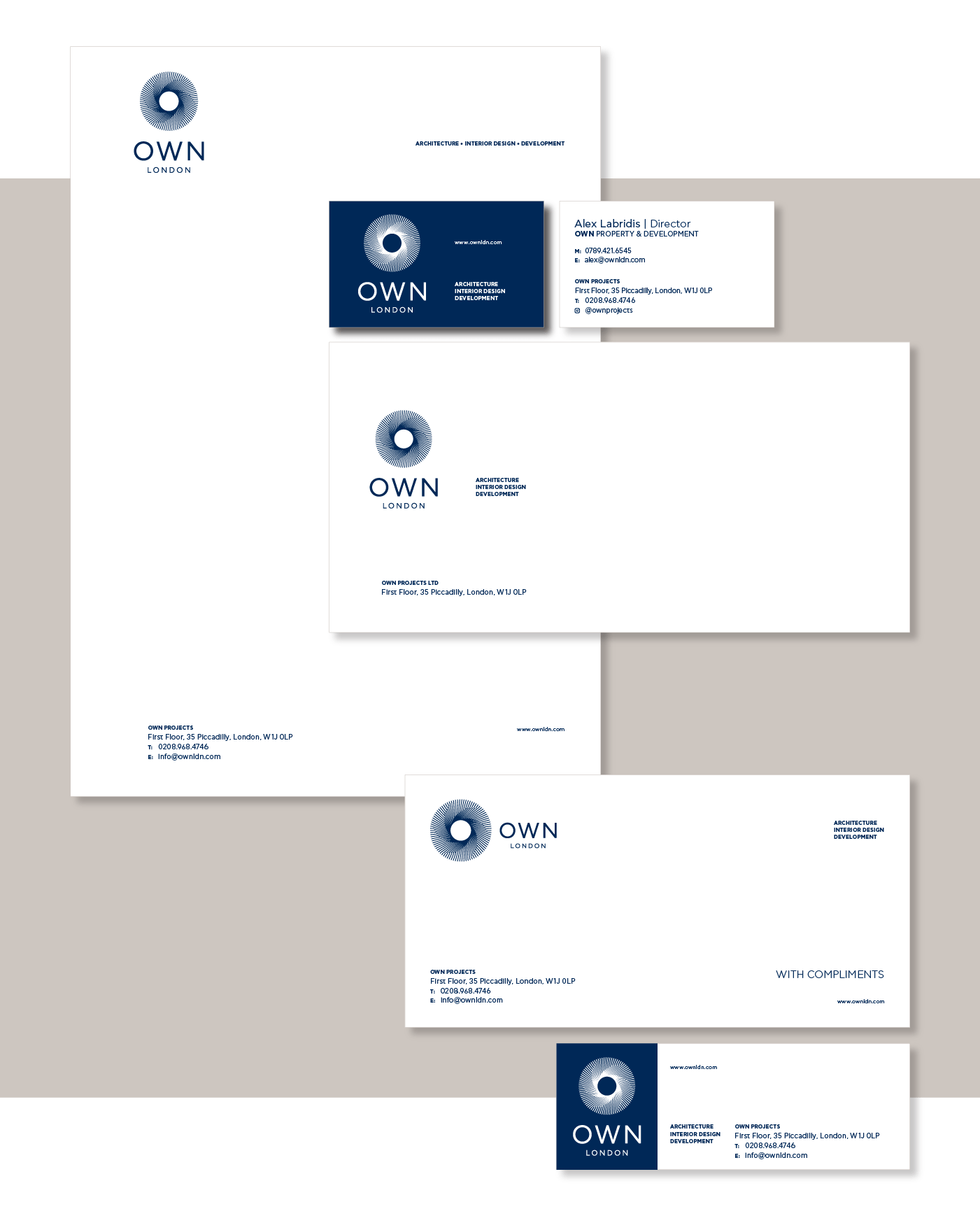
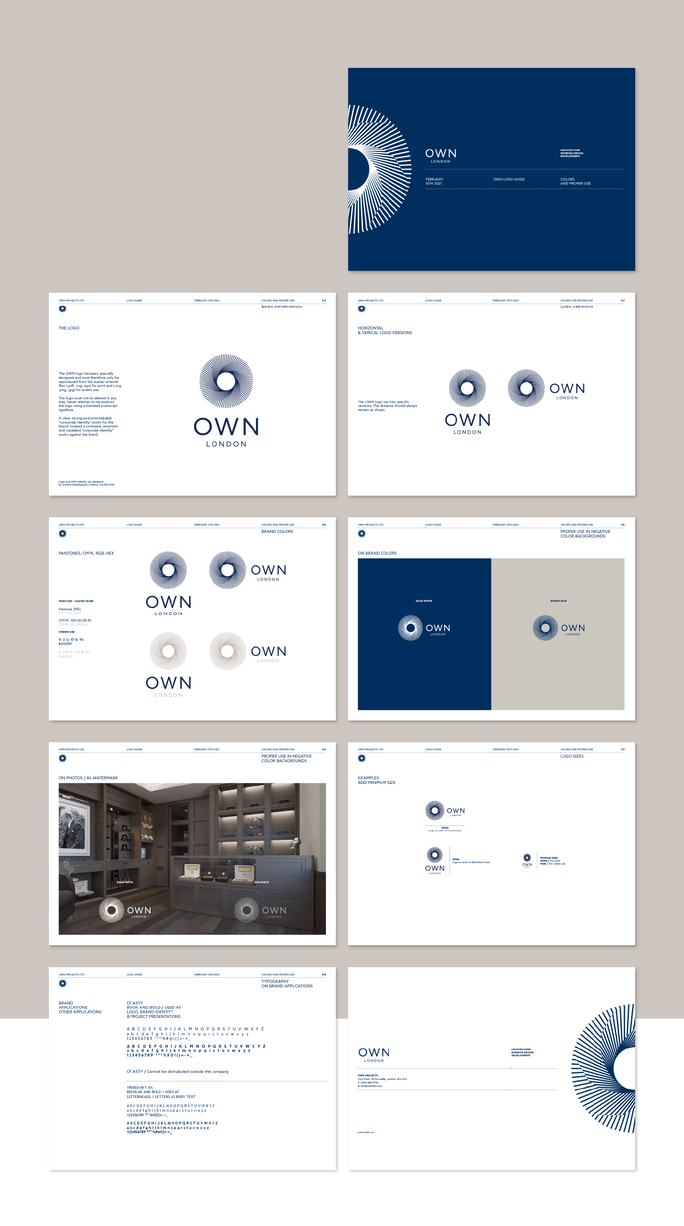
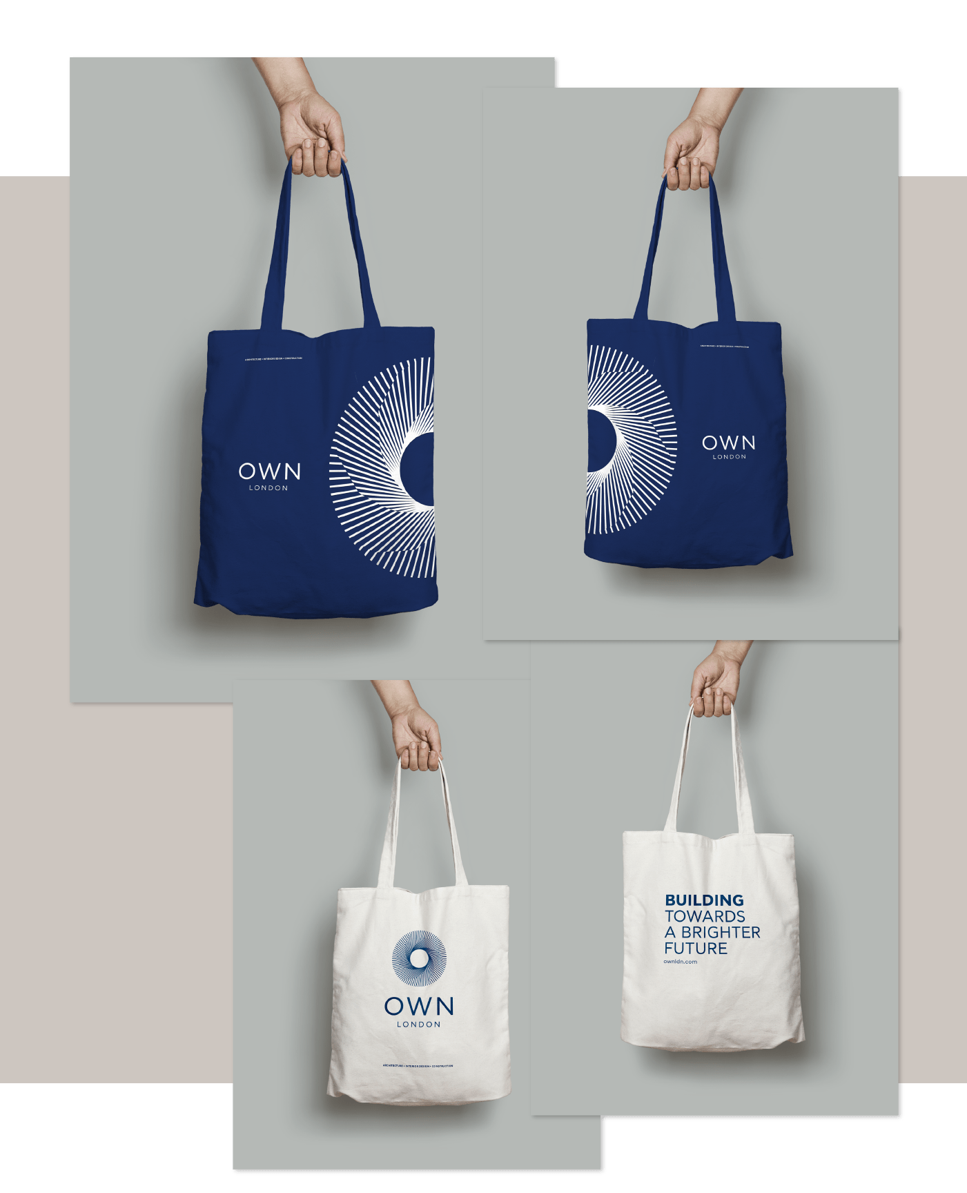
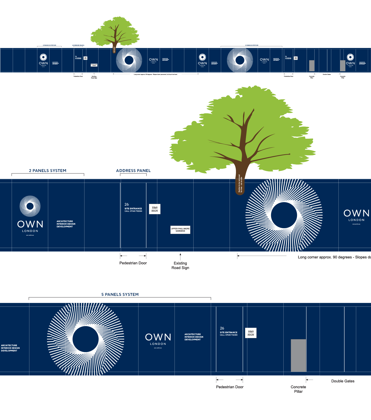
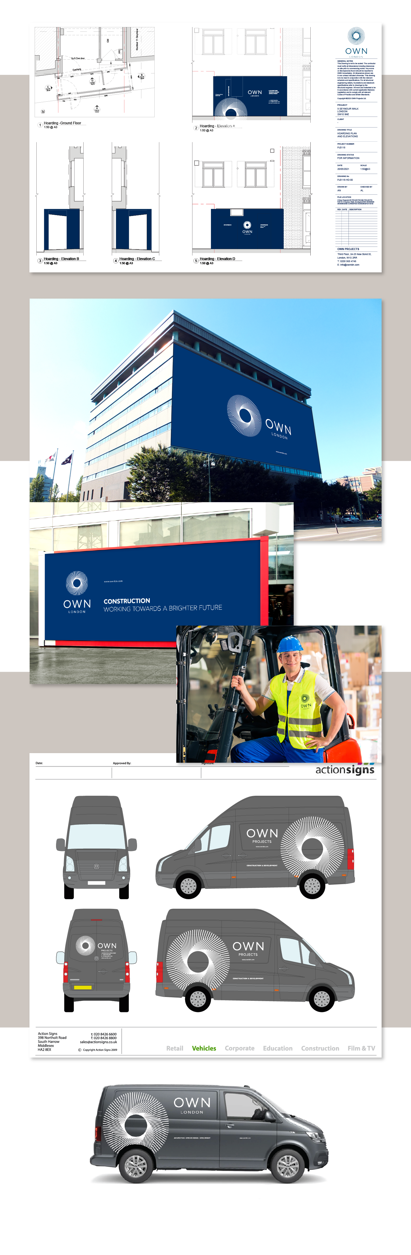
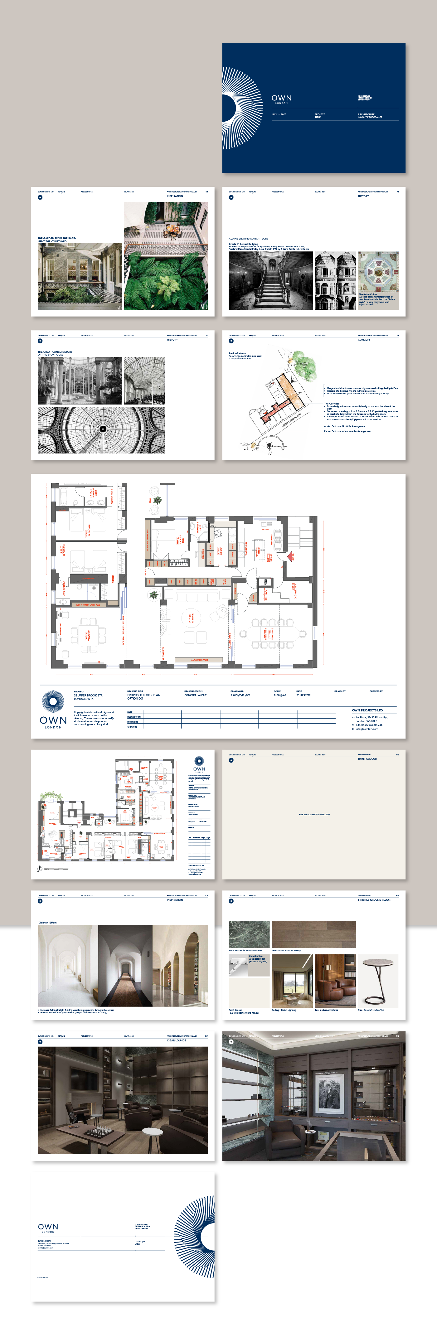
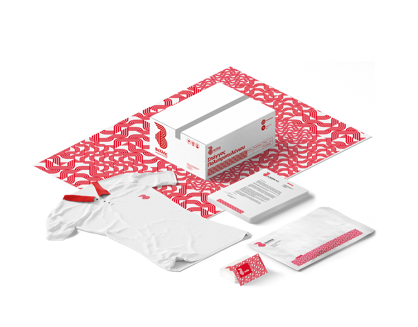
We've created the new company identity, the classic stationary, brand guidelines book and some applications such as tote bags and clothing for the personnel and a presentation system for their projects.
The OWN logo redesign received a gold prize award at the 12th WOLDA awards 2021.
CREDITS
Client: Own London
Project Managment: Alex Labridis, Magdalini Sgouridi
CAD Template Design: Georgia Papadopoulou
Logo Animation: Paris Pateli
Fonts: CF Asty by Fonts.gr
Client: Own London
Project Managment: Alex Labridis, Magdalini Sgouridi
CAD Template Design: Georgia Papadopoulou
Logo Animation: Paris Pateli
Fonts: CF Asty by Fonts.gr