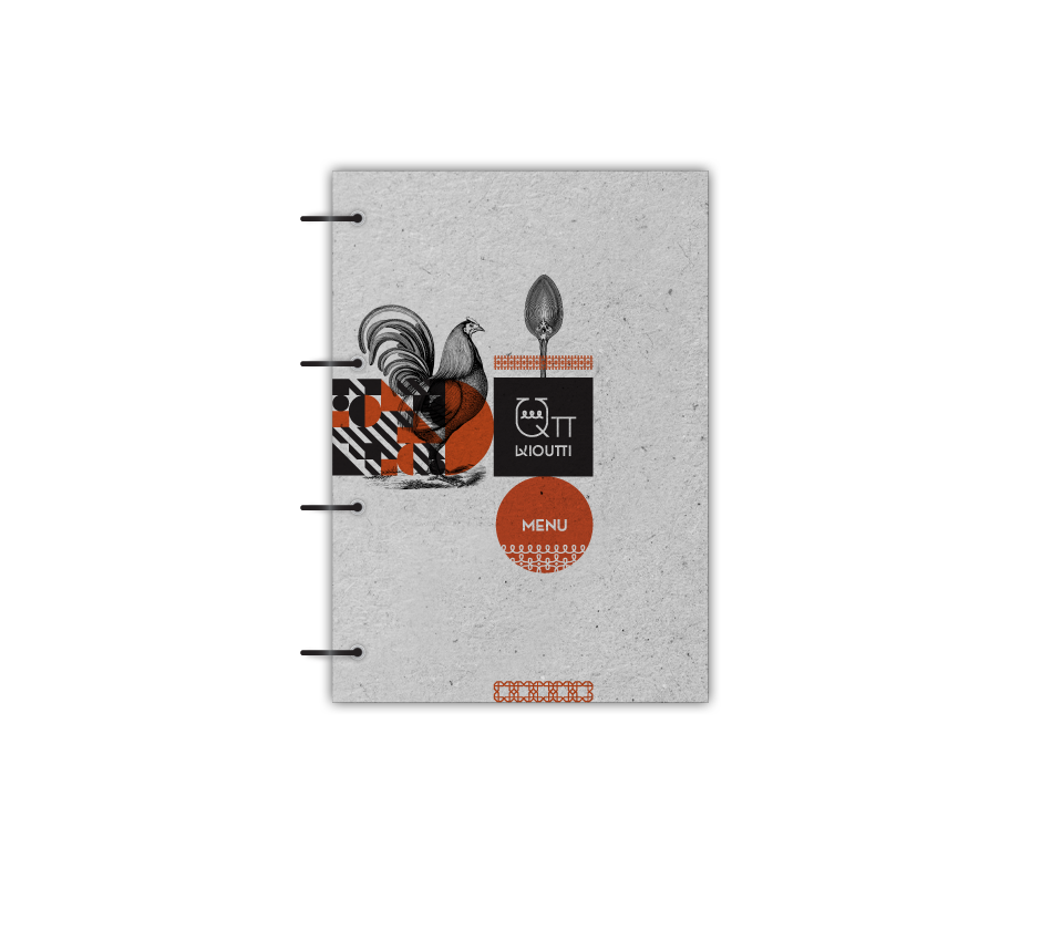
Qπ
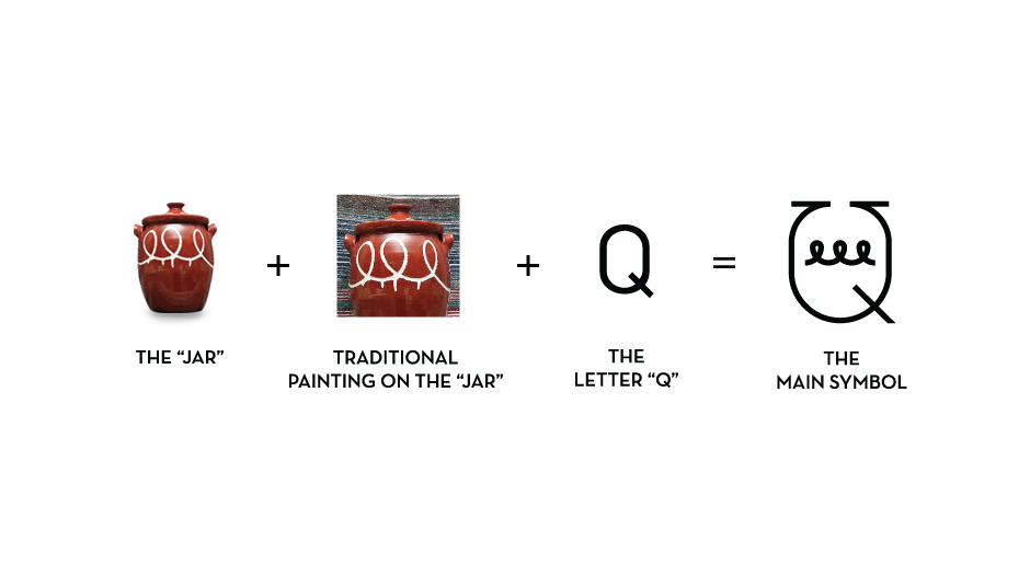
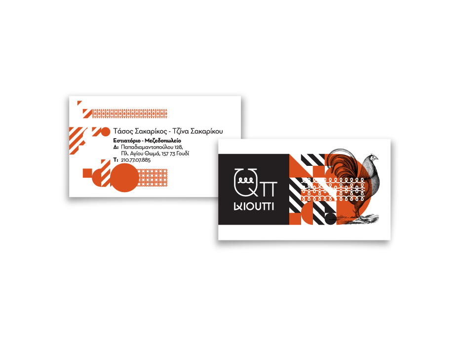
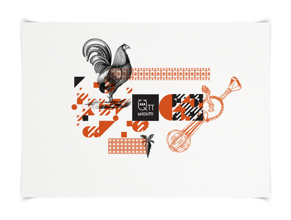
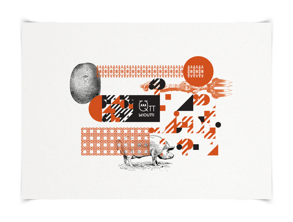
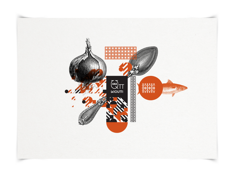
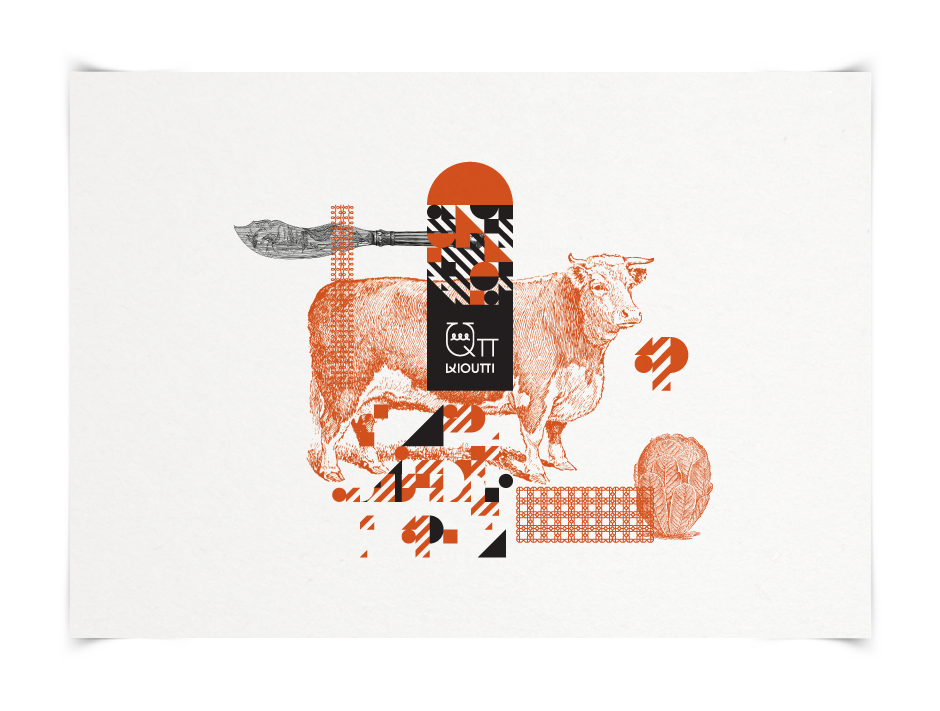
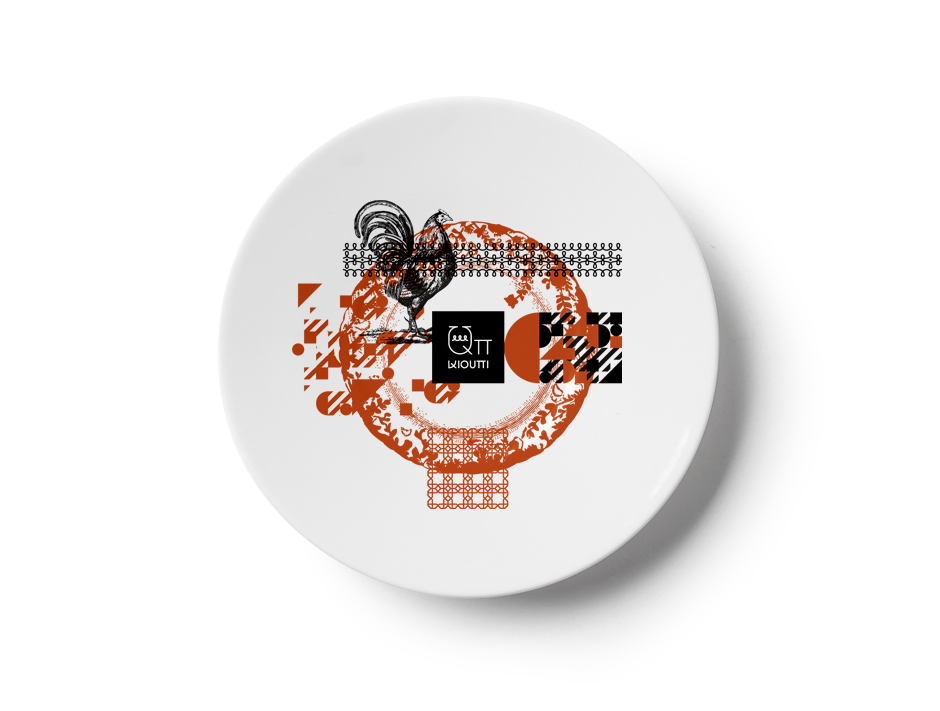
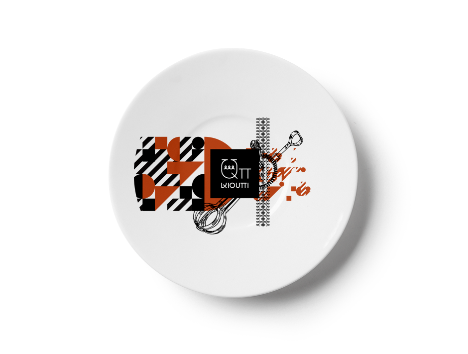
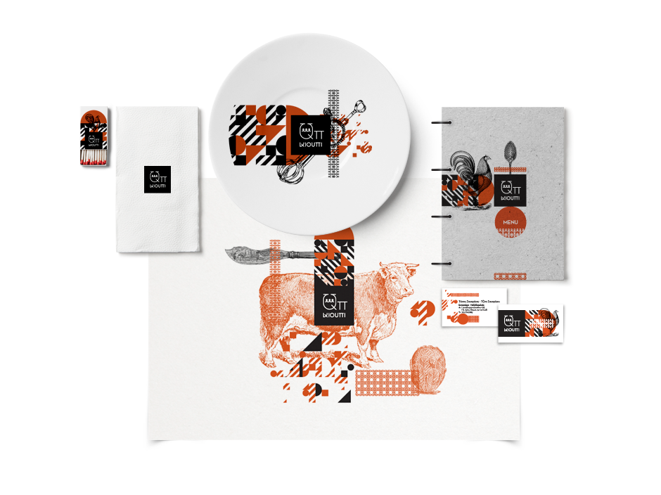
“Qπ”, pronounced “qioupe” (greek = κιούπι) is a new restaurant located on a nice and busy neighborhood of Athens, Greece. A qioupe is actually a traditional cooking jar. We came up with the name and logo by combining the english letter “Q” and the Greek letter “π” (pi). The result acoustically sounds like the greek word. To make the restaurant identity unique we did new lettering from scratch.
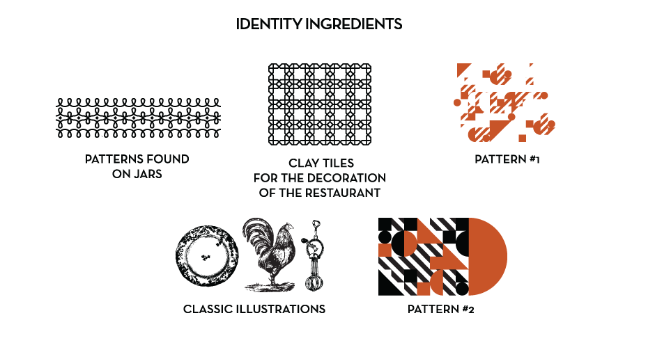
One of the main elements of the restaurant identity are the five main ingredients used by the cooks of the restaurant. Another main element is two patterns, one found on the traditional qioupe jars and the other borrowed from the clay tile used in the restaurant. We combined these elements with found vintage illustrations that depict animals (that are actually in the restaurant’s dishes) and utensils such as forks and knives.
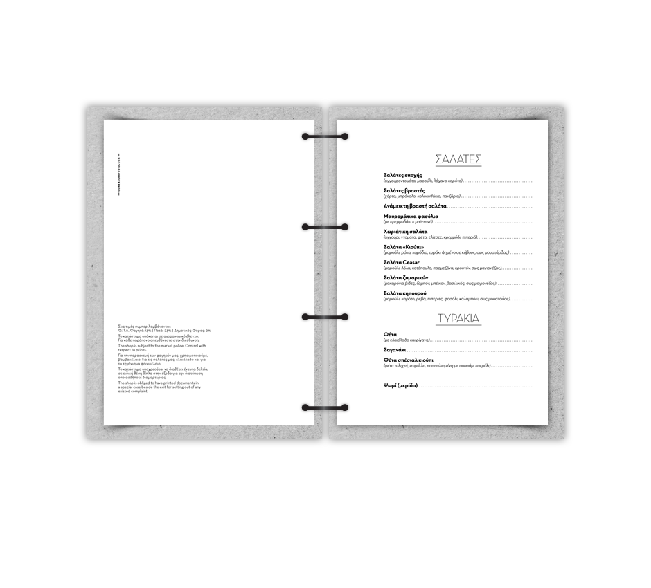
The menu covers were printed on hard grey cardboard and each menu was then binded with black metal loops. It’s a simple solution, as the restaurant’s owners wanted to be able to change the menu pages as the daily menu changes very often, almost daily.
Credits
Copy: Vasso Kanellopoulou
Final name concept: Penny Zevoli
Menu Printing: Metaxas S.A.
Civil Engineer: Thanasis Raftopoulos
Architect: Anita Konti
Final name concept: Penny Zevoli
Menu Printing: Metaxas S.A.
Civil Engineer: Thanasis Raftopoulos
Architect: Anita Konti