HEMI / Hub for the Exchange of Music Innovation.
Branding and visual identity
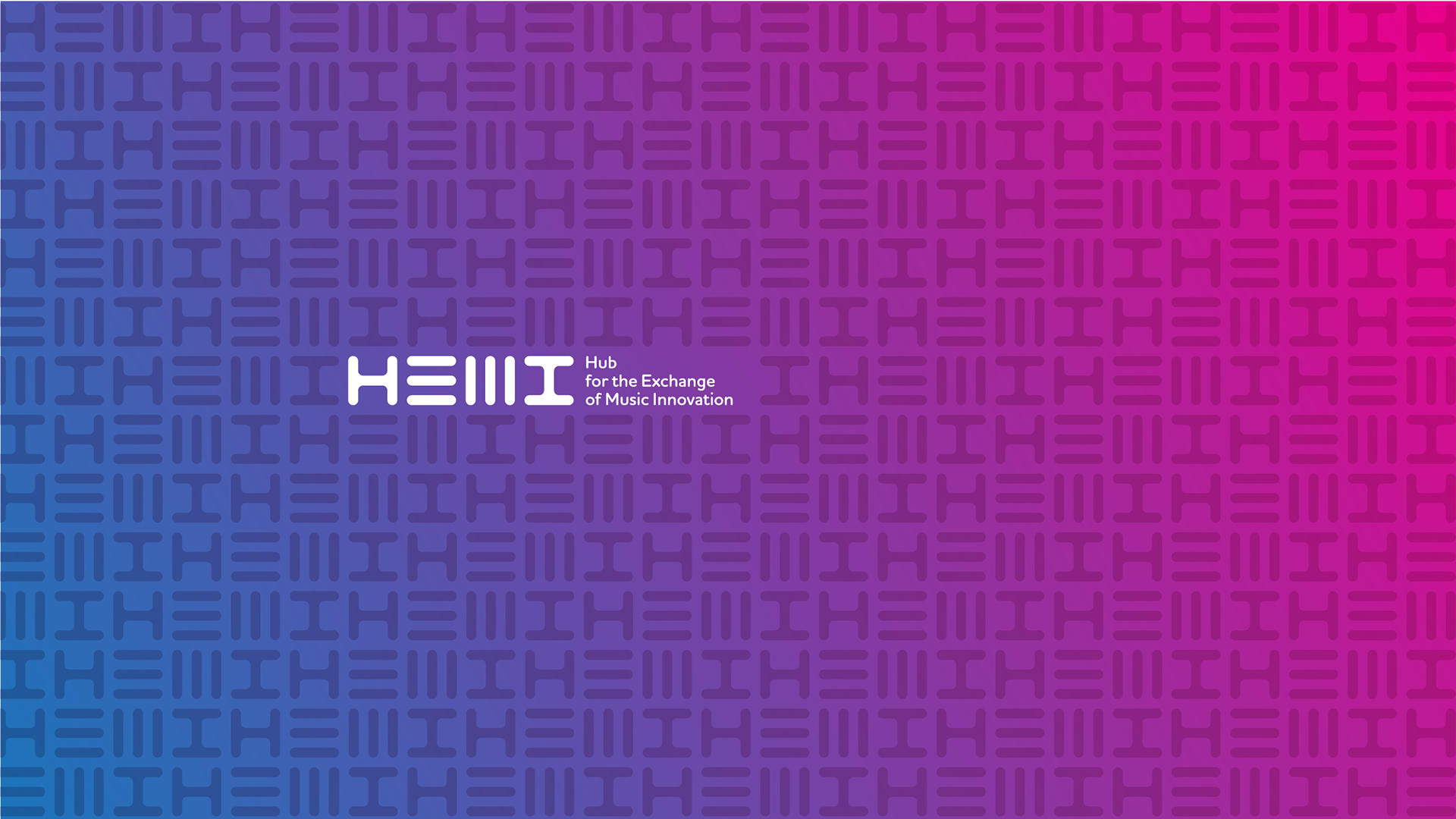
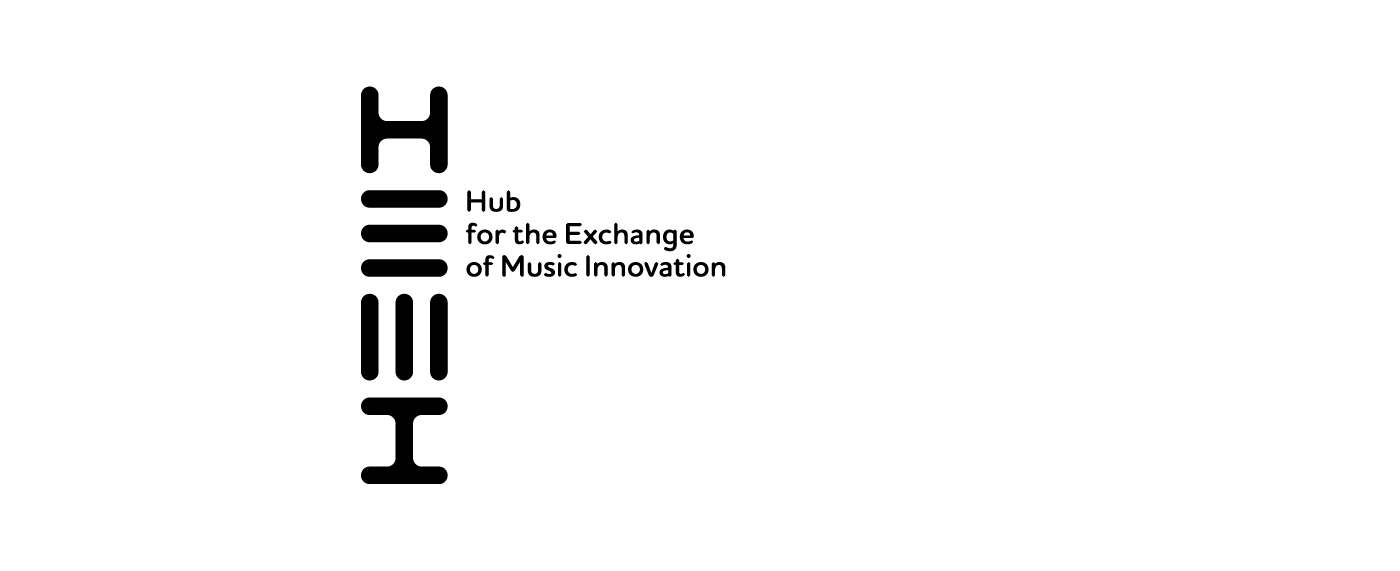
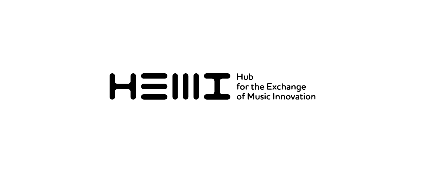
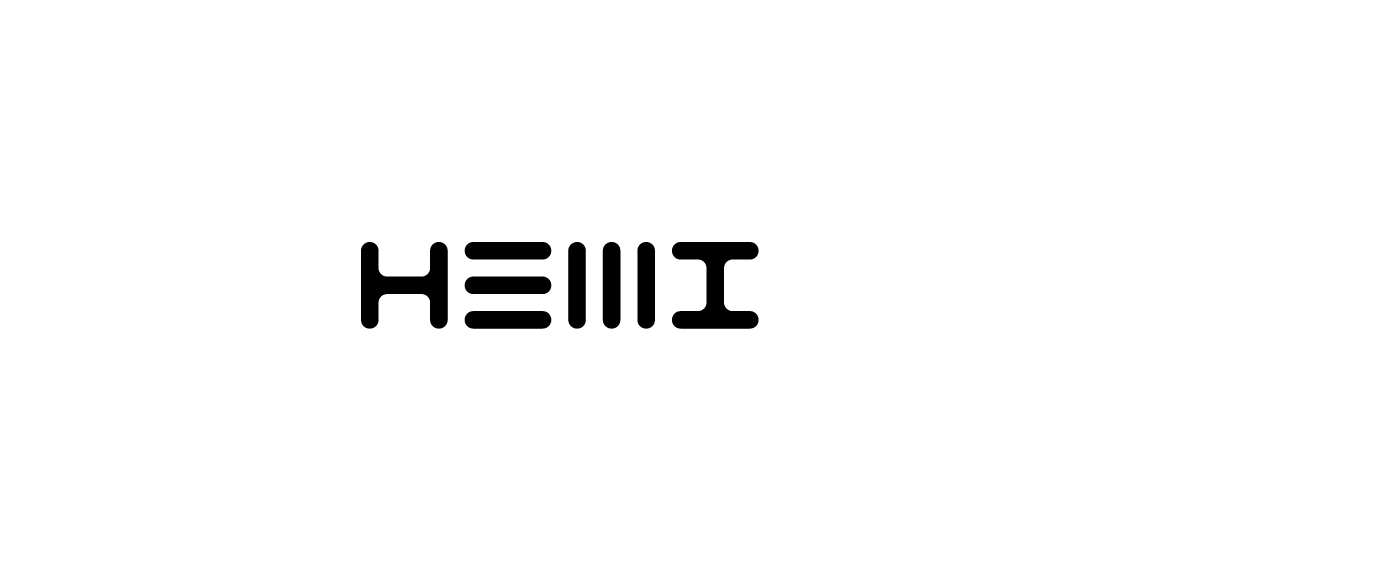
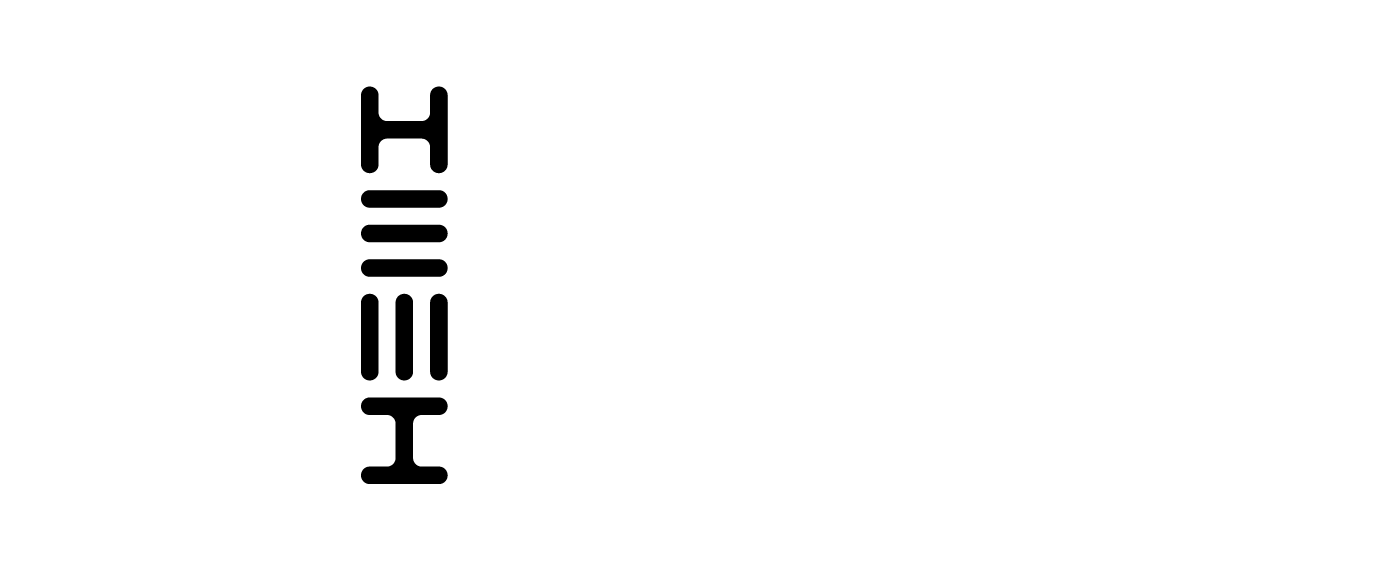
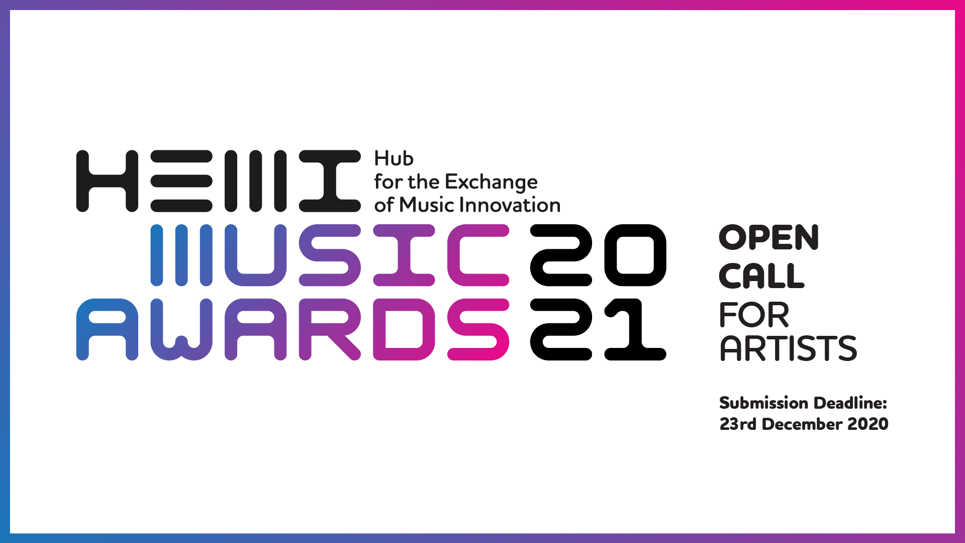
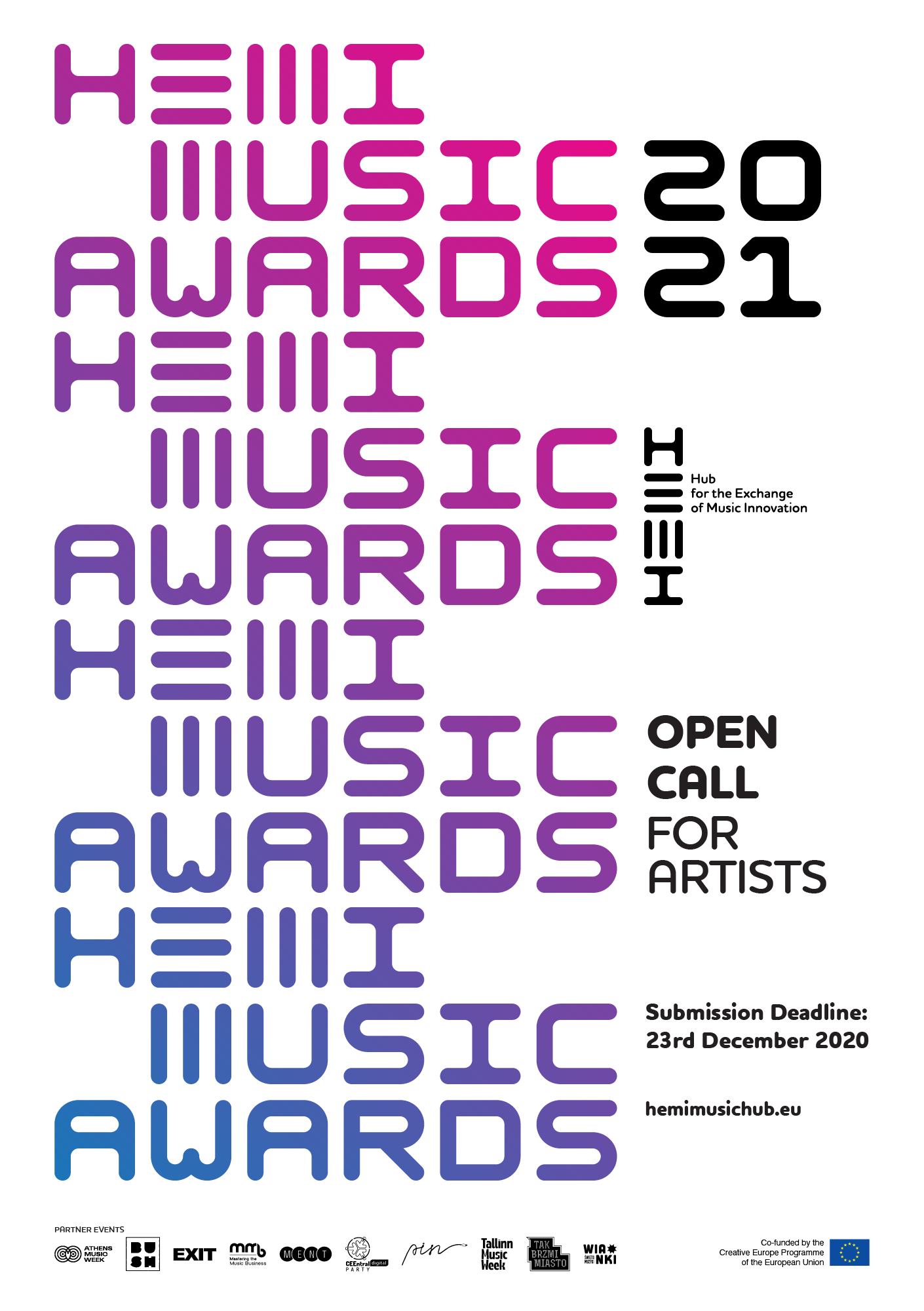
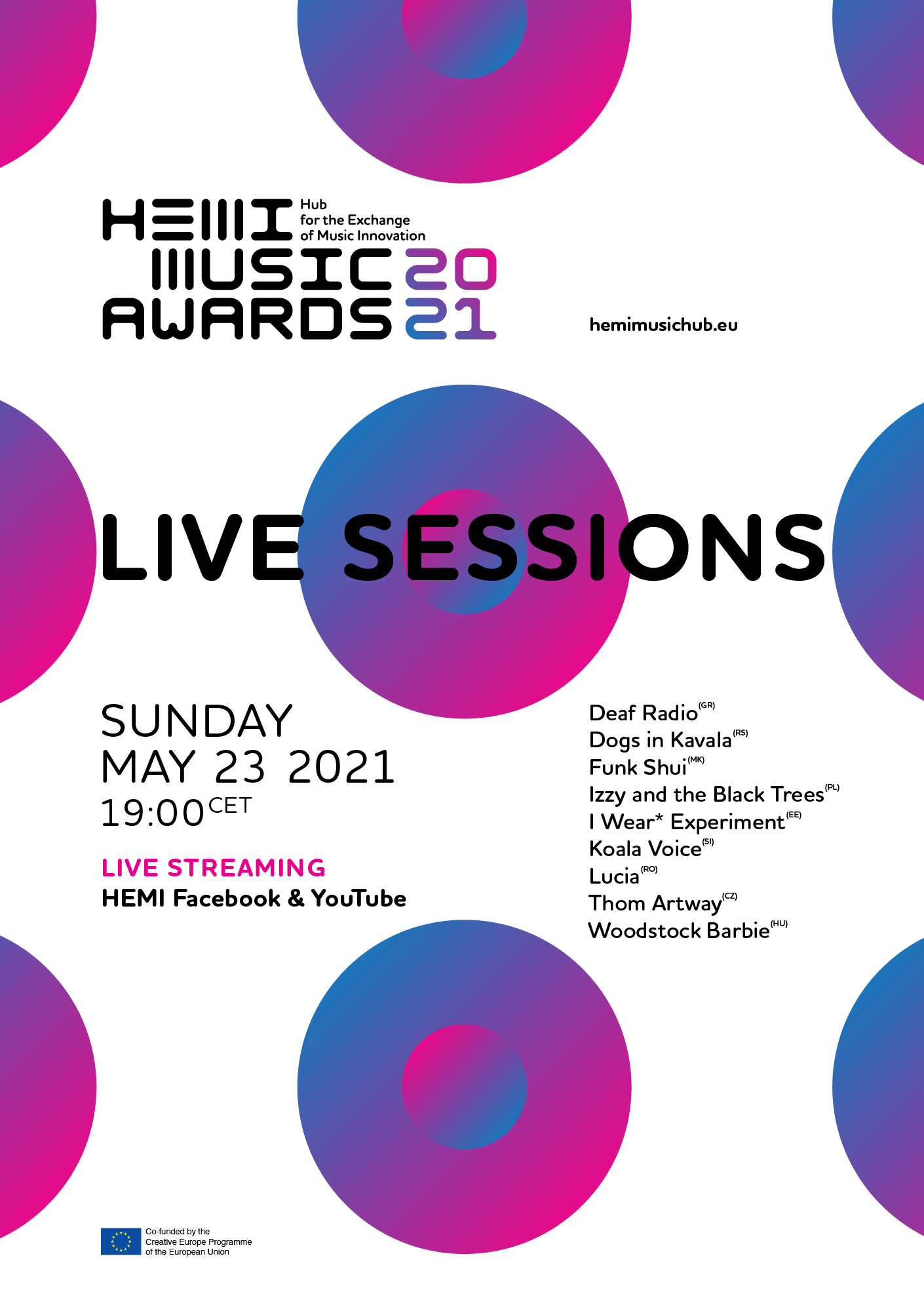
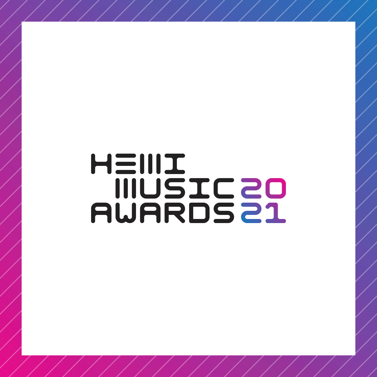
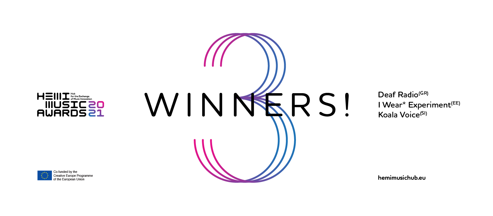
The HEMI typographic logo is based on a simple 3 lines grid, that works in both vertical and horizontal way, as an "ambigram". A simple system that uses form and rhythm and relates to music. On a later stage, for the needs of Hemi Music Awards - 2021 logo, more typographic characters were designed in order to keep a strong and solid visual language throughout the project. Black type, strong gradients and geometric shapes were the key elements that we used for the rest of the (mostly digital) promotional applications.
The HEMI logo received a bronze prize award at the 12th WOLDA awards 2021 / New logos Europe & Africa category.
Check the HEMI music awards 2021 live sessions here.
INFO ABOUT THE PROGRAMME
The Hub for the Exchange of Music Innovation (HEMI) is an initiative of 10 music organisations from Central and South Eastern Europe (CSEE), co-funded by the Creative Europe Programme of the European Union for 4 years (2020-23)
The Hub for the Exchange of Music Innovation (HEMI) is an initiative of 10 music organisations from Central and South Eastern Europe (CSEE), co-funded by the Creative Europe Programme of the European Union for 4 years (2020-23)
In a time dominated with troublesome news, partners from Czech Republic, Estonia, Greece, Hungary, North Macedonia, Poland , Romania, Serbia and Slovenia have joined forces to support the professionalisation and internationalisation of Artist and Music entrepreneurs of the region.
Co-funded by the Creative Europe programme of the European Union, our vision is to trademark Central and South Eastern European Music Creativity.
Client: HEMI, Technopolis City of Athens
Project coordinator: Georges Perot
Communication coordinator: Natalie Tsirigoti
Social Media: Marina Sakellariou, Vasiliki Kanellopoulou
Video & Original Music score: Pink Element
Logo animation: Christina Iliopoulou @Icdesign
Secondary Font: Houschka Rounded by Nick Cooke @G-Type
Project coordinator: Georges Perot
Communication coordinator: Natalie Tsirigoti
Social Media: Marina Sakellariou, Vasiliki Kanellopoulou
Video & Original Music score: Pink Element
Logo animation: Christina Iliopoulou @Icdesign
Secondary Font: Houschka Rounded by Nick Cooke @G-Type