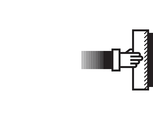
Train Station Symbols design
BA Digital Design @Vakalo Art & Design College ©2021
2nd Year | Graphic Design Applications Course
November 25th - December 23rd 2021
Tutor:
Dimitris Kanellopoulos
Tutor:
Dimitris Kanellopoulos
Brief:
Design a symbol set for the needs of a train station that it's placed in a different - past period of time and country. Then design a cover for a train time schedule.
Design a symbol set for the needs of a train station that it's placed in a different - past period of time and country. Then design a cover for a train time schedule.
Each student was given a specific place and time period. A good research was mandatory in order for the designers to have a good understanding of the era and study the different culture. So it's an icon design project with a time twist.
Participants / Era / Country:
Nikos Giannios / 1935 / Great Britain
Elena Konstantinidi / 1940 / Japan
Anna Vitsa / 1955 / USA
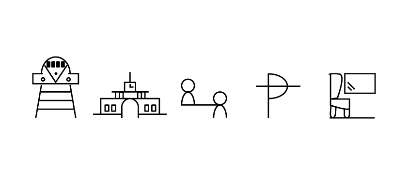
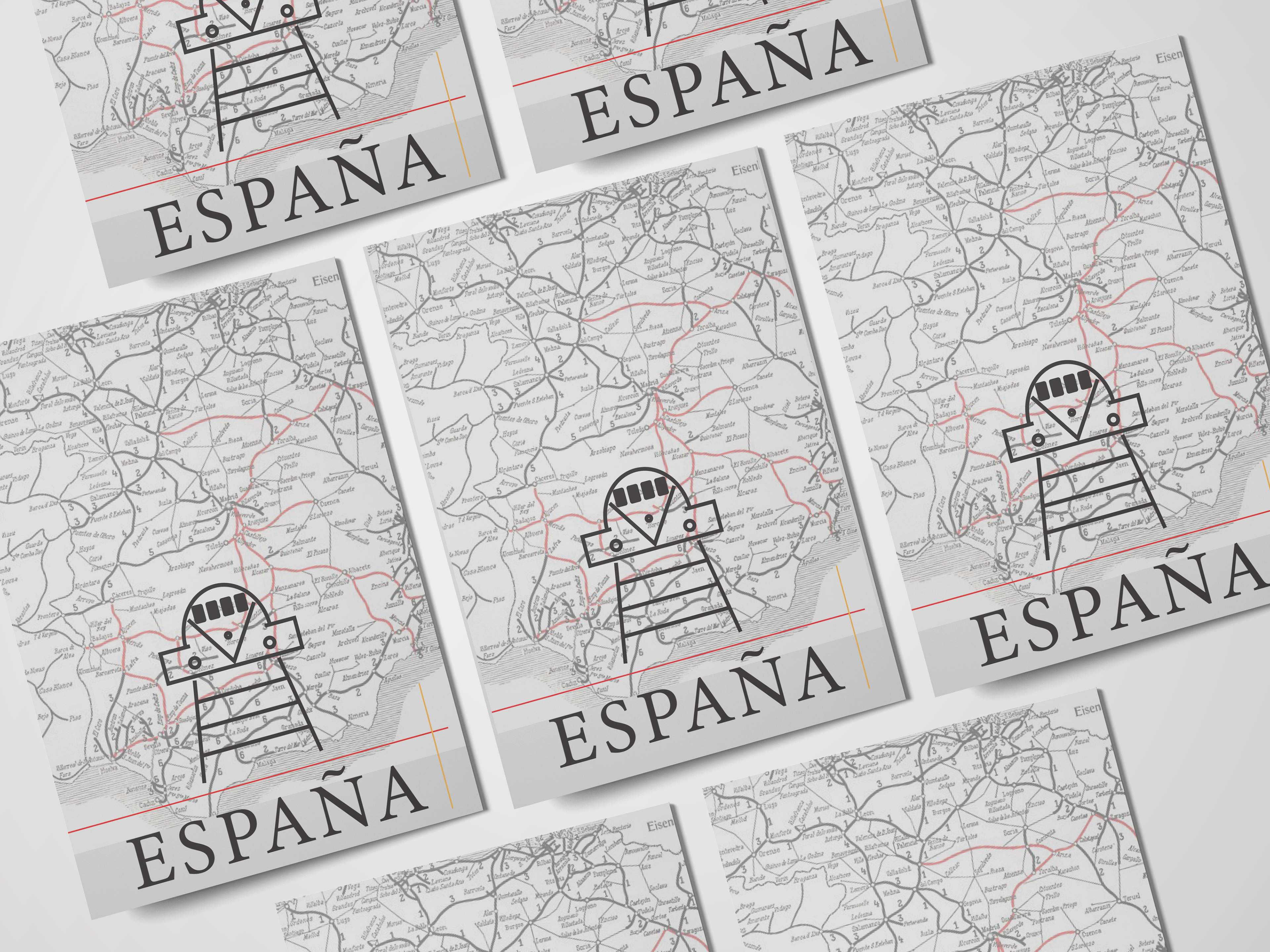
Vicky Chachami / 1960 / Spain
Mara Louloudi / 1965 / France
Labros Georgiou / 1965 / Netherlands
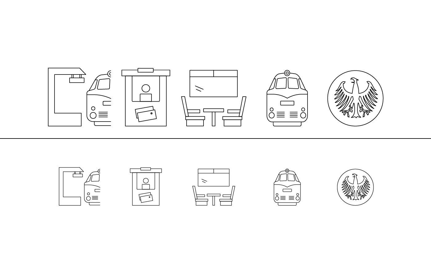
Panagiotis Zamanis / 1970 / Germany
Demi Panagou / 1985 / Soviet Union
:::::::::::::::::::::::::::::::::::::::::::::::::::::::::::::::::::::::::::::::::::::::::::::::::::::::::::::::::::
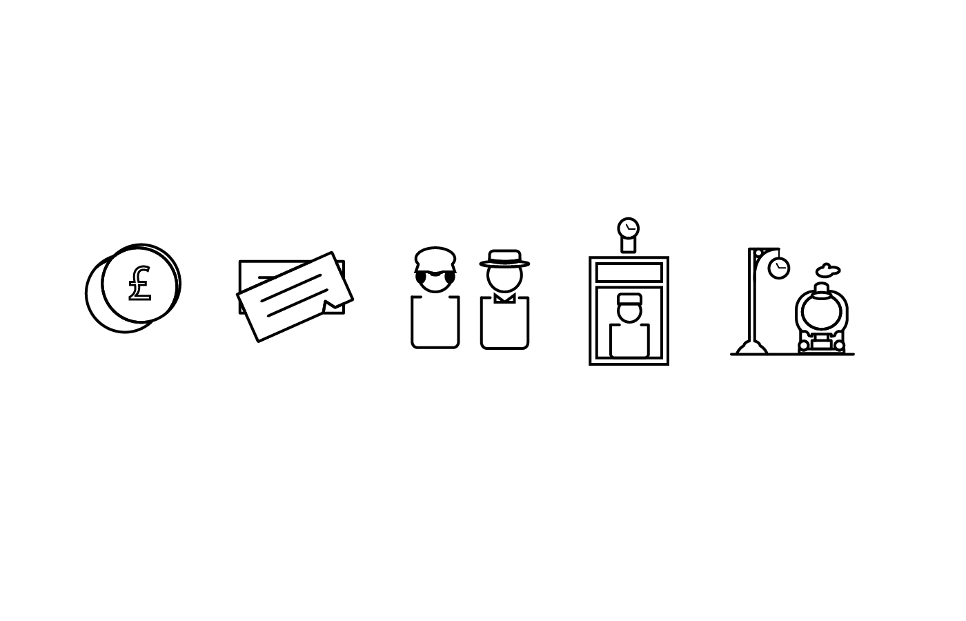
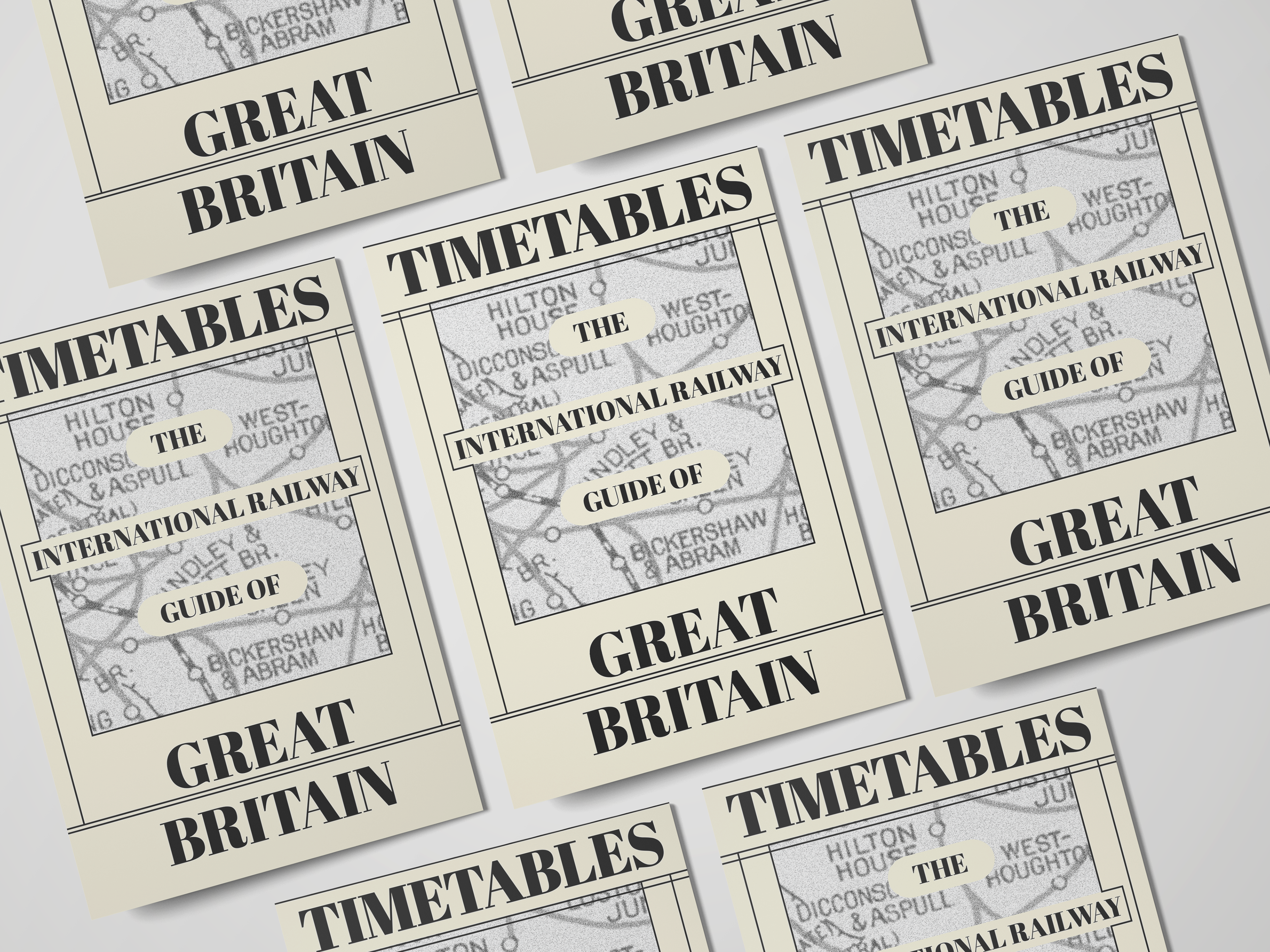
Nikos Giannios / 1935 / Great Britain
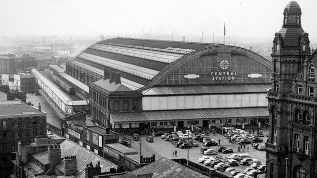
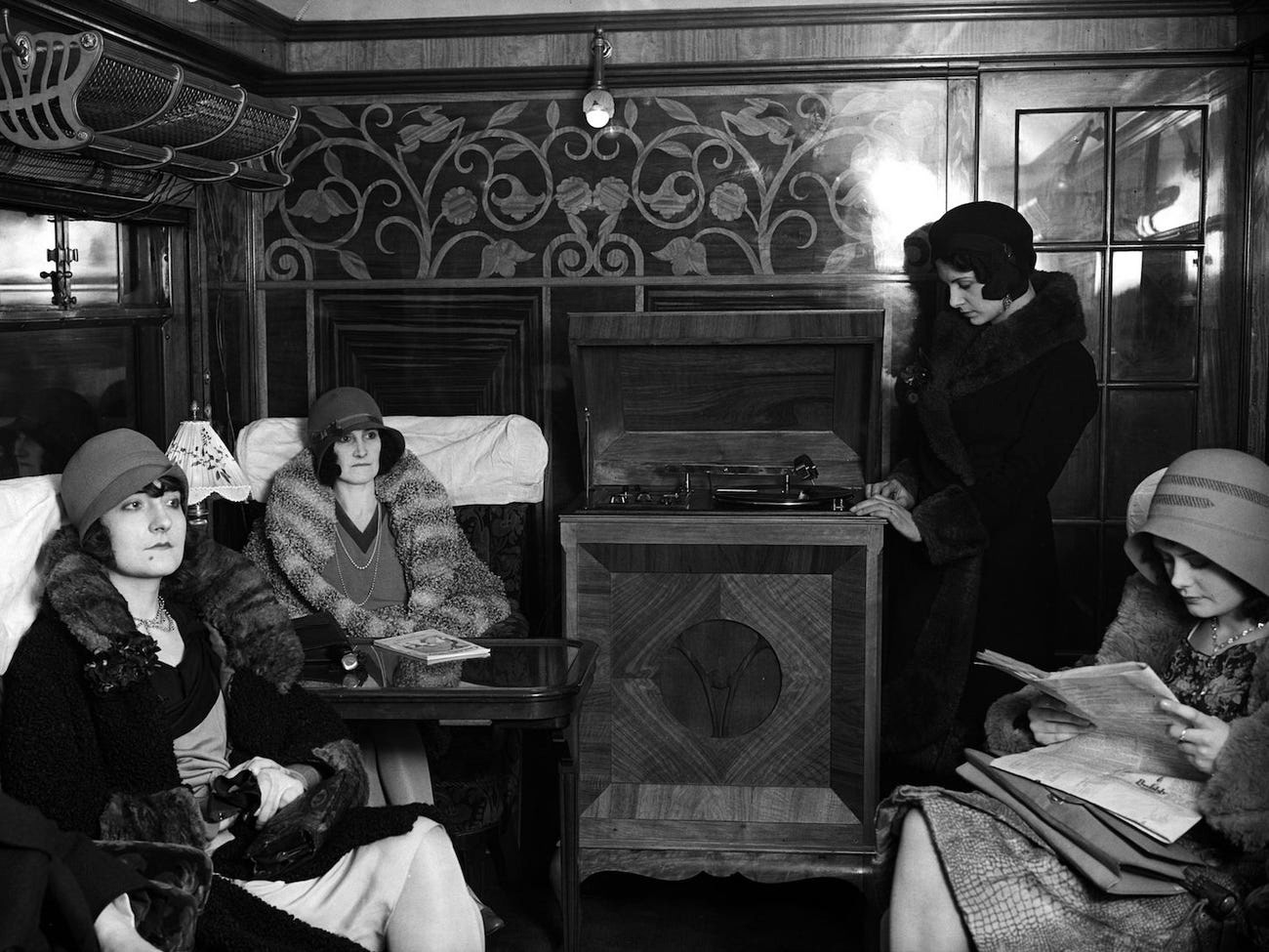
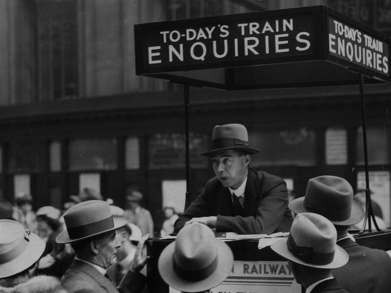
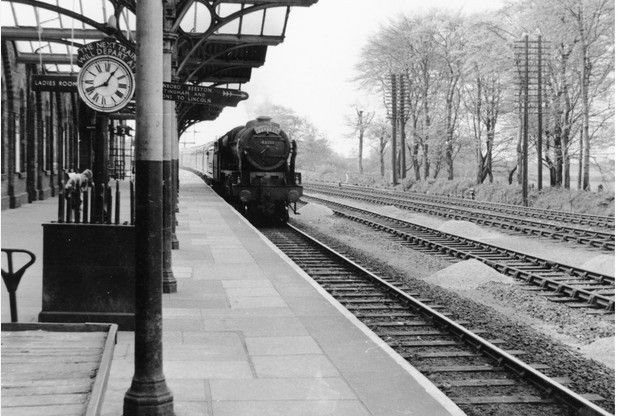
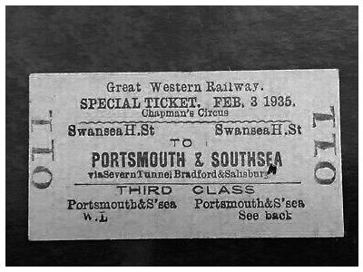
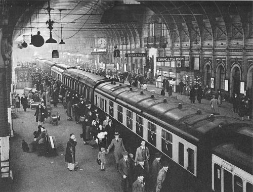
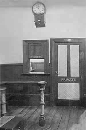
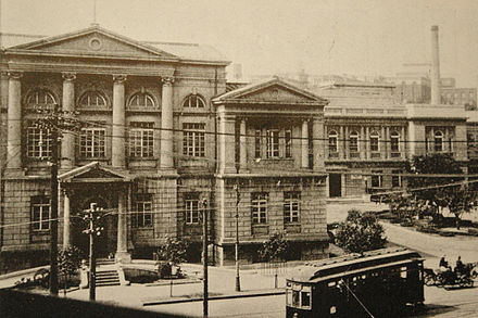
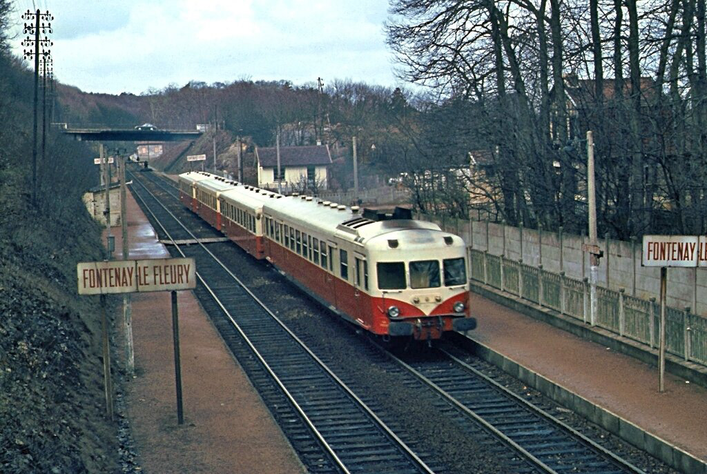
The British railway system had been initially built up by more than a hundred railway companies. World War One (WW1) ended in 1918 and the railways were in a parlous state after being brought under Government control and used primarily for military purposes. After WW1 Britain’s railways were almost bankrupt because of the Government’s financial arrangements with the railway companies. This was followed by the great depression bringing a huge change to society. The nationalisation of the railways, which had been mooted as early as the 1830s, was considered, but was rejected by the government and the owners of the rail companies. A compromise was created. Under this act, almost all of the hundreds of existing rail companies were grouped together into ‘The Big Four’. The second half of the 1930s are often considered to be the golden age of railways, abruptly ended by the outbreak of World War Two (WW2).
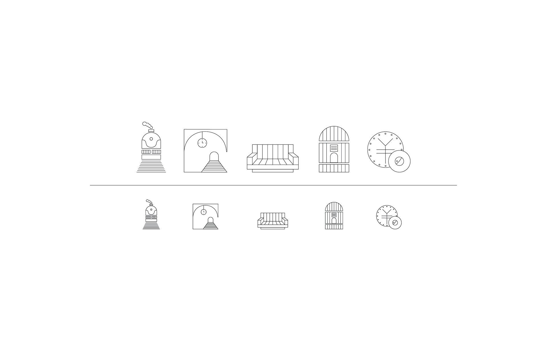
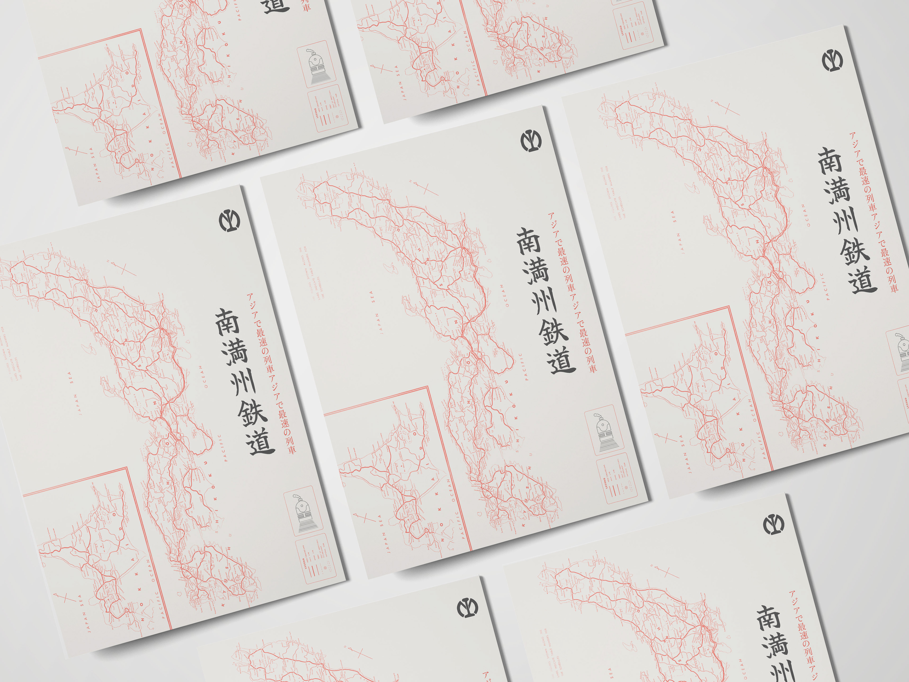
Elena Konstantinidi / 1940 / Japan
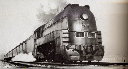
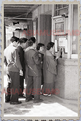
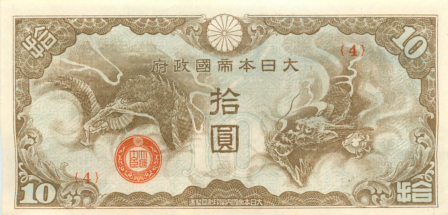
Τhis series of symbols refers to the 1940s Japan trains. In 1940 the imperial Japan entered World War II by signing the Tripartite Pact with Germany and Italy. Although, Japan was at war it had an evolved rail transport. From 1934 until 1943 operated the Asia Express. It was a streamlined air-conditioned train powered by a big engine at a nominal speed of 63 miles per hour. Through my research and photographic material I found that the Japan of 1940 follows in its designs the fine lines, the details and the clarity. I rendered these three elements in my series of symbols that have been designed only with outline and geometric shapes that alternate with curved lines into individual features. As for the train program cover, it is designed in three colors, white, black and red, while the map of Japan is an element that I used to convey its strong decorative mood.
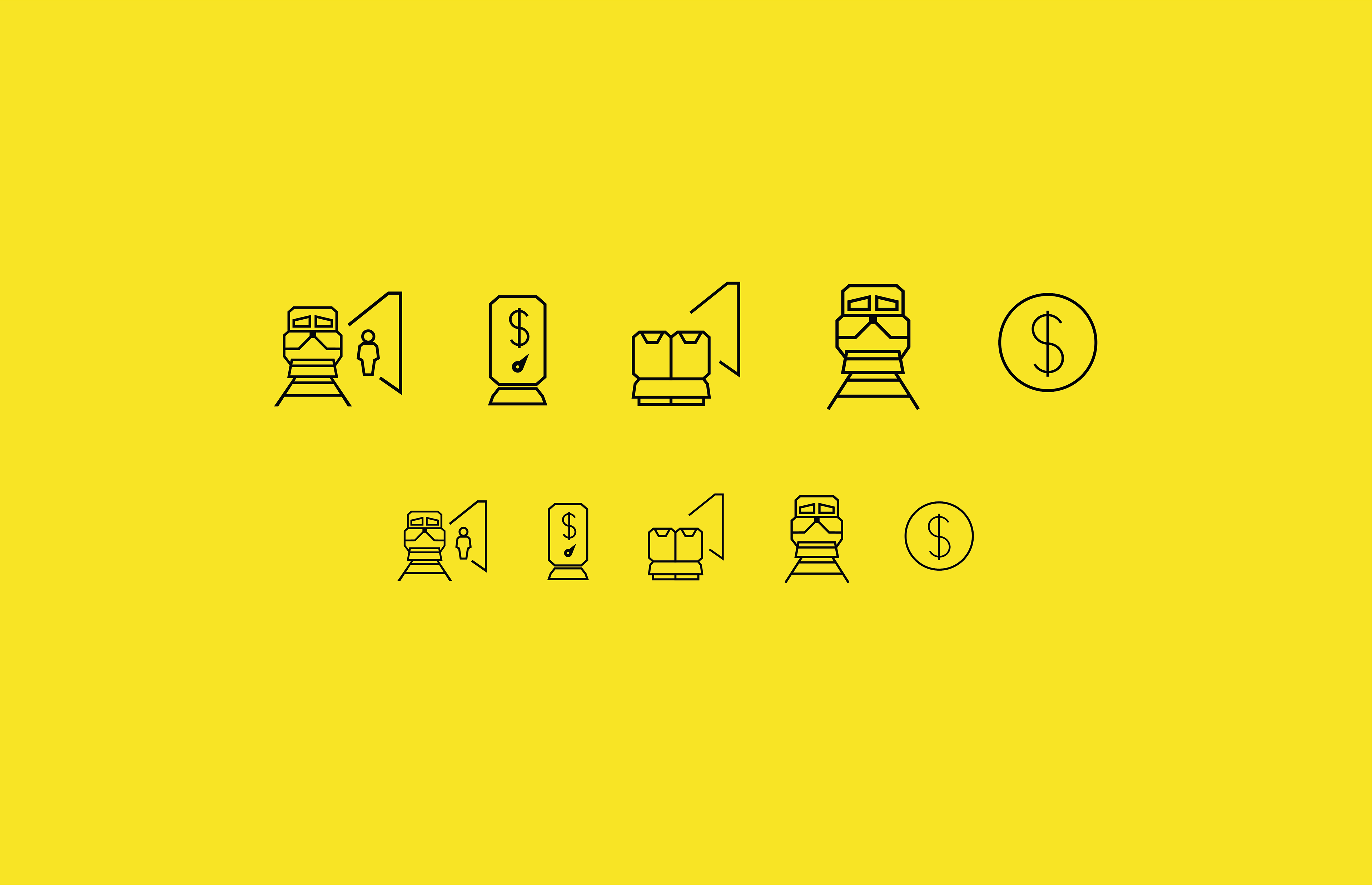
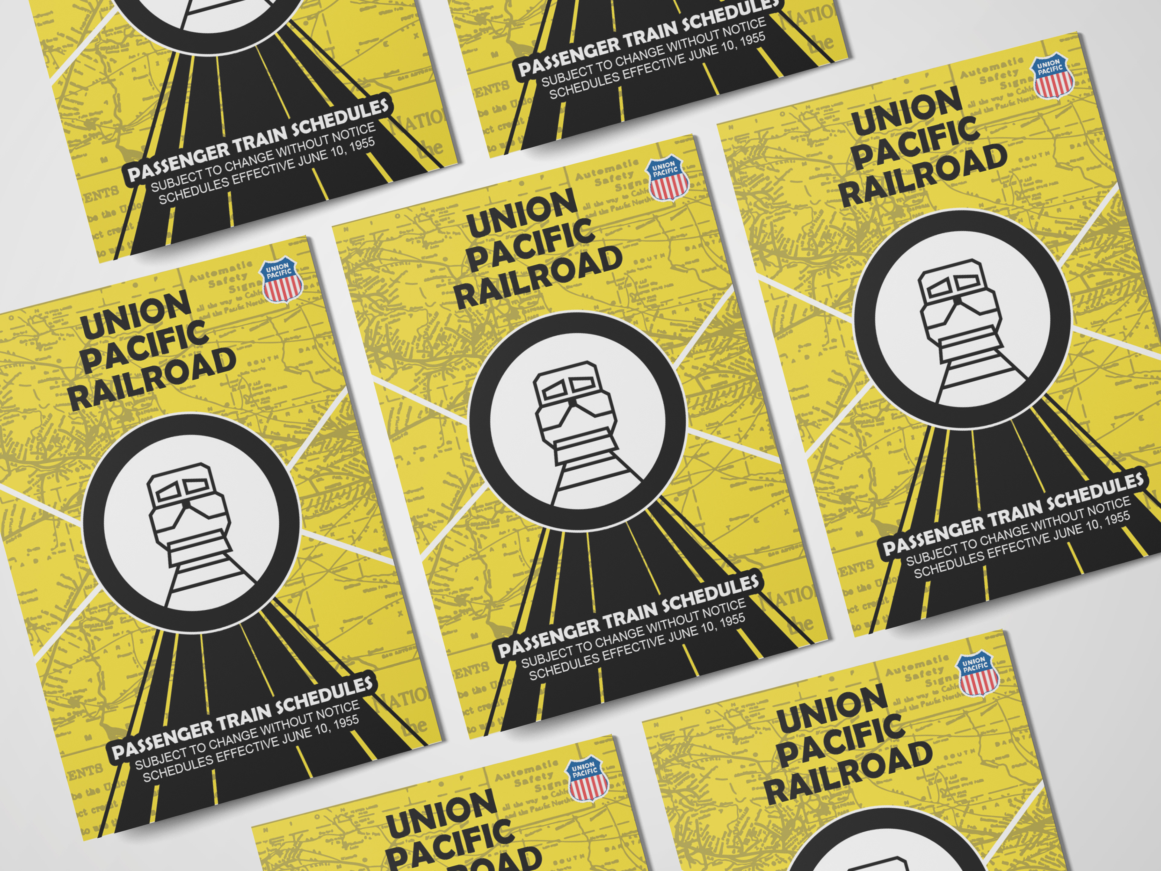
Anna Vitsa / 1955 / USA

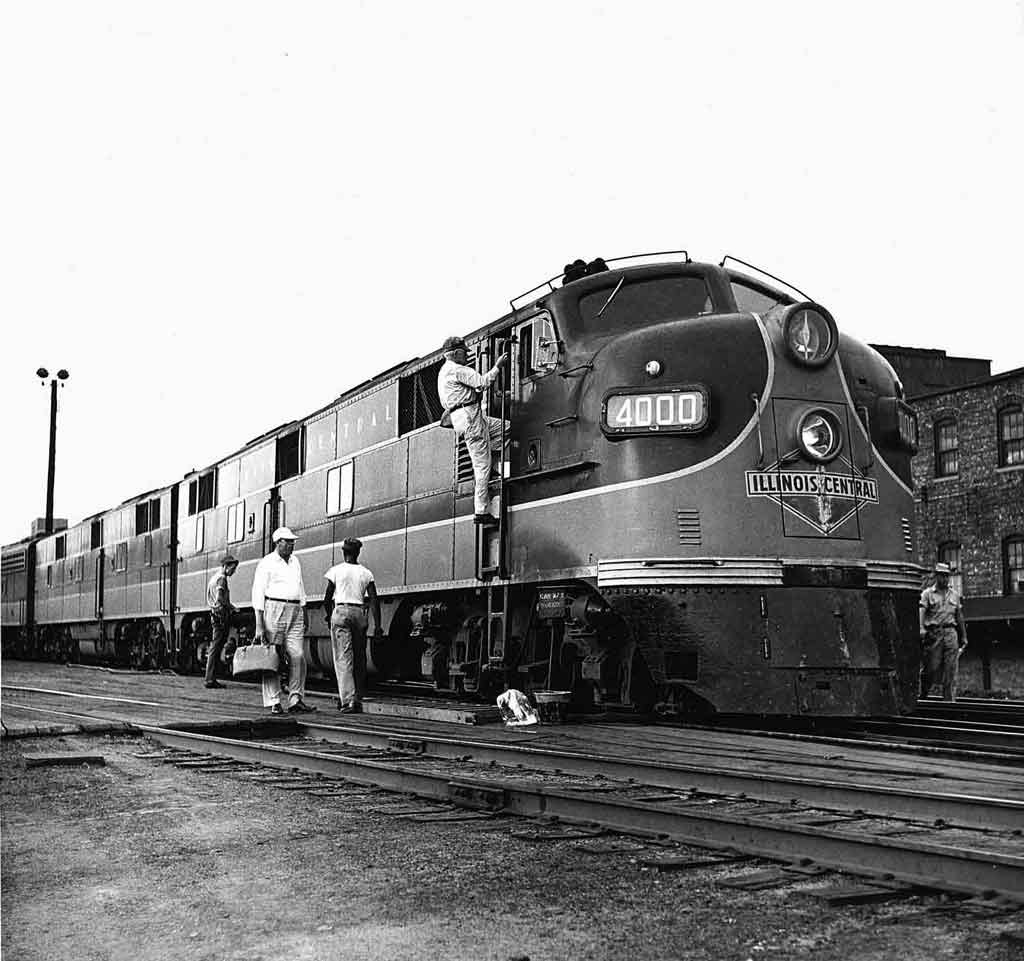
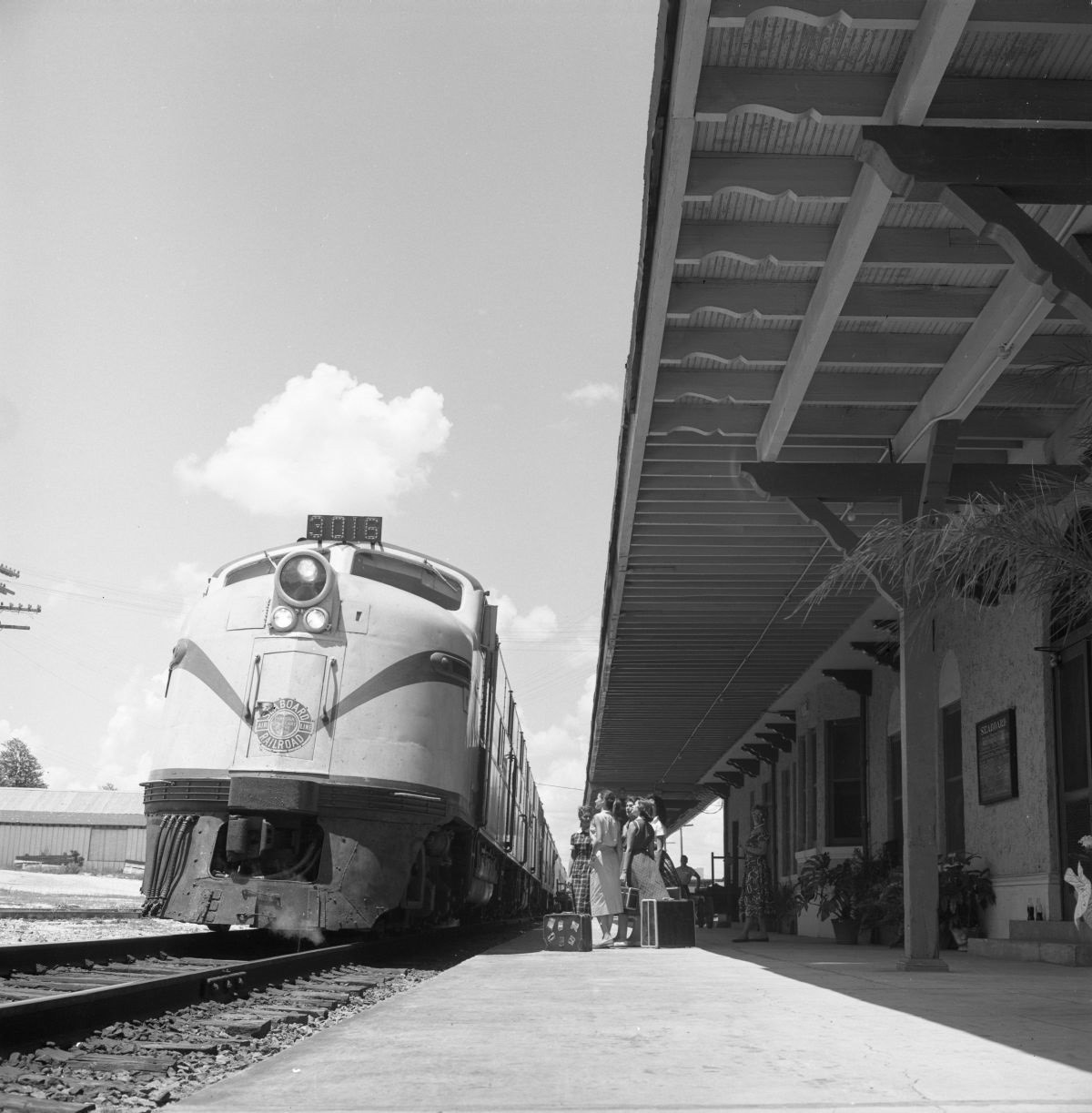
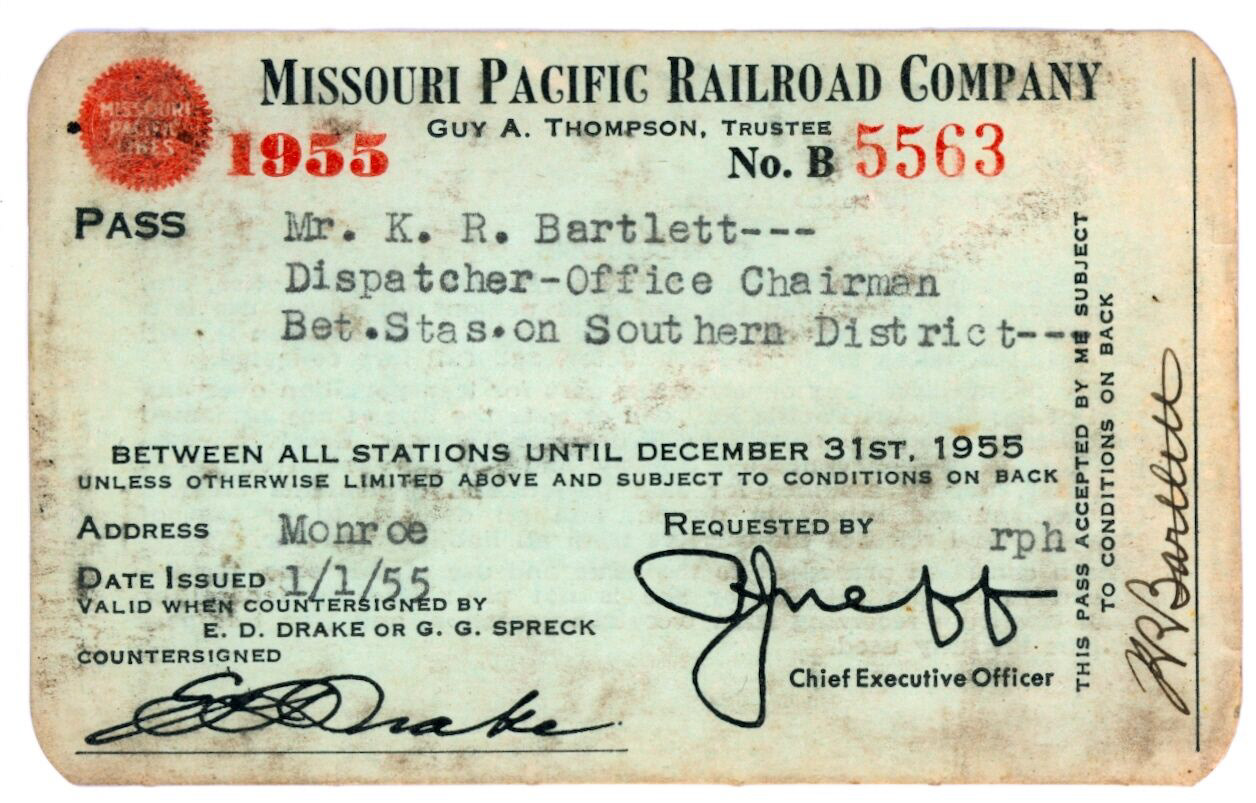


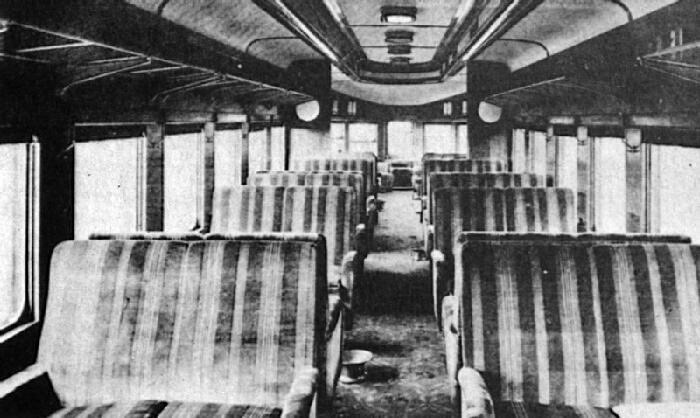
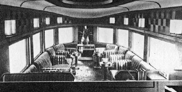
These symbols were designed for the Railway Station in the United States of America in 1955, mainly based off of the E7 model with its iconic vertical “bull-dog” nose. Although originally designed for freight service, they were also adopted widely in passenger service. Inspired by USA’s bold and sans serif typography commonly found in flyers, signs and everyday life products during the 1950’s, these symbols for the Pacific Railway were created accordingly to showcase the simplicity and effectivity of good design and the atmosphere in USA during this period.
Vicky Chachami / 1960 / Spain
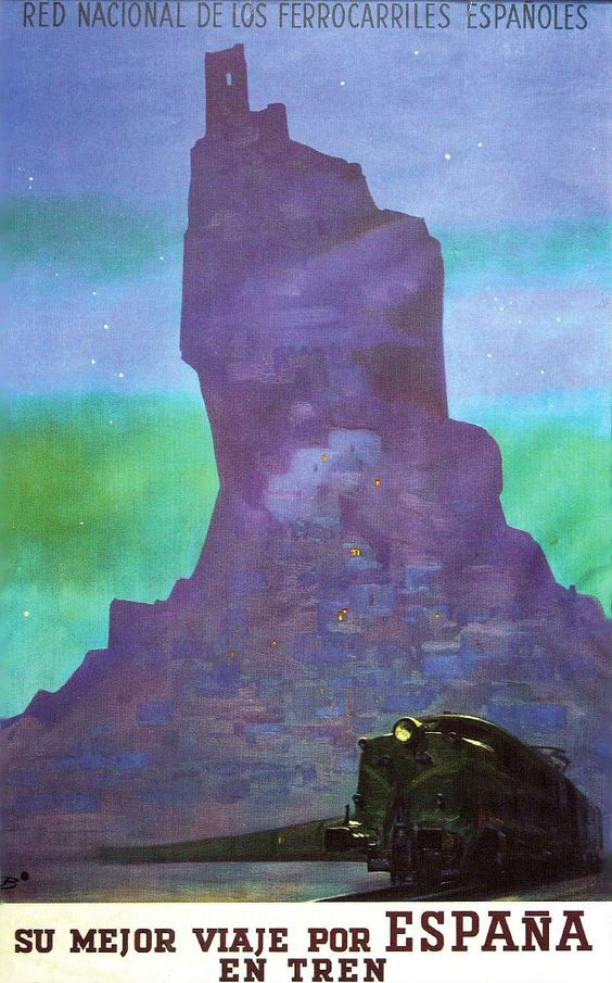
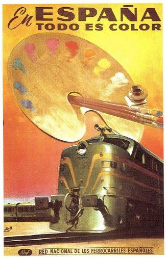
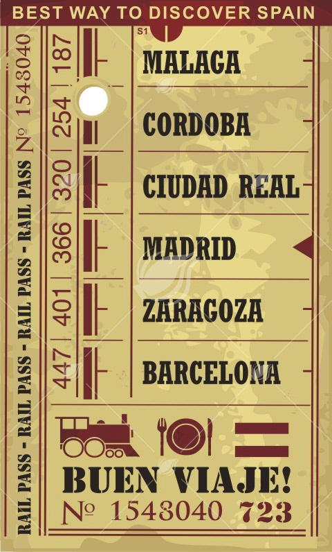
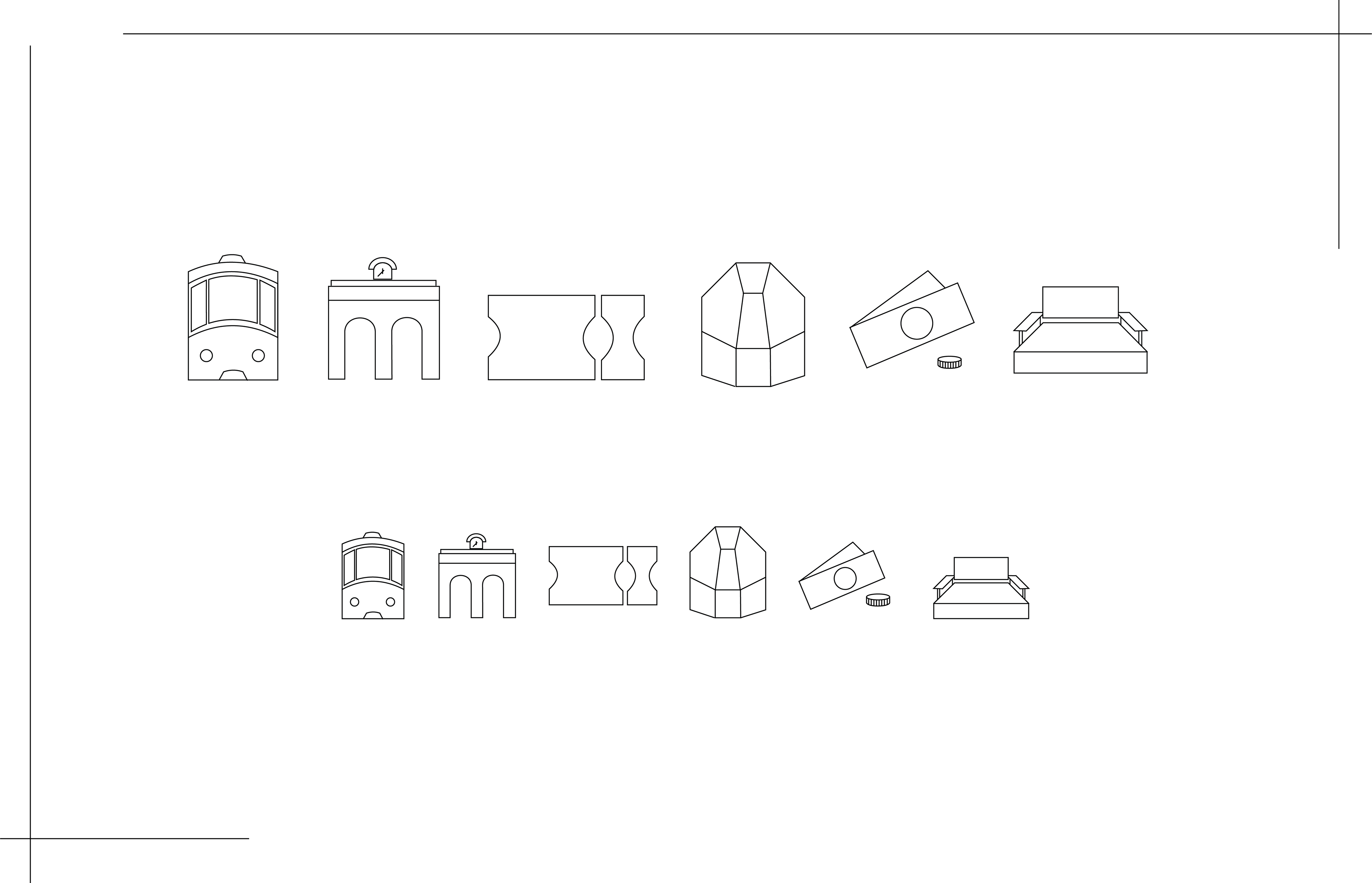
5 symbols about a train station and the whole process of traveling by a train. Initially, this project began with much research on the historic events in Spain around this era. The next step, was to find pictures of trains, tickets, coins, seats and also colors to fully comprehend the style of the 60s in Spain.
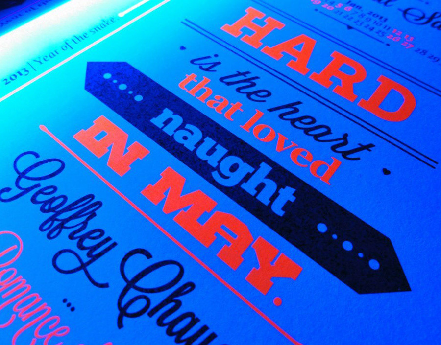
Mara Louloudi / 1965 / France
In this period de Gaulle achieved his two main objectives: to reform and develop the French economy, and to promote an independent foreign policy and a strong stance on the international stage. This was, as named by foreign observers, the "politics of grandeur" (politique de grandeur). The development also came in the trains and the proposal for the TGV (Train à Grande Vitesse) was first made in the 1960s. At that time the French government favored new technologies by researching the production of hovercraft and magnetic trains such as the Aérotrain.
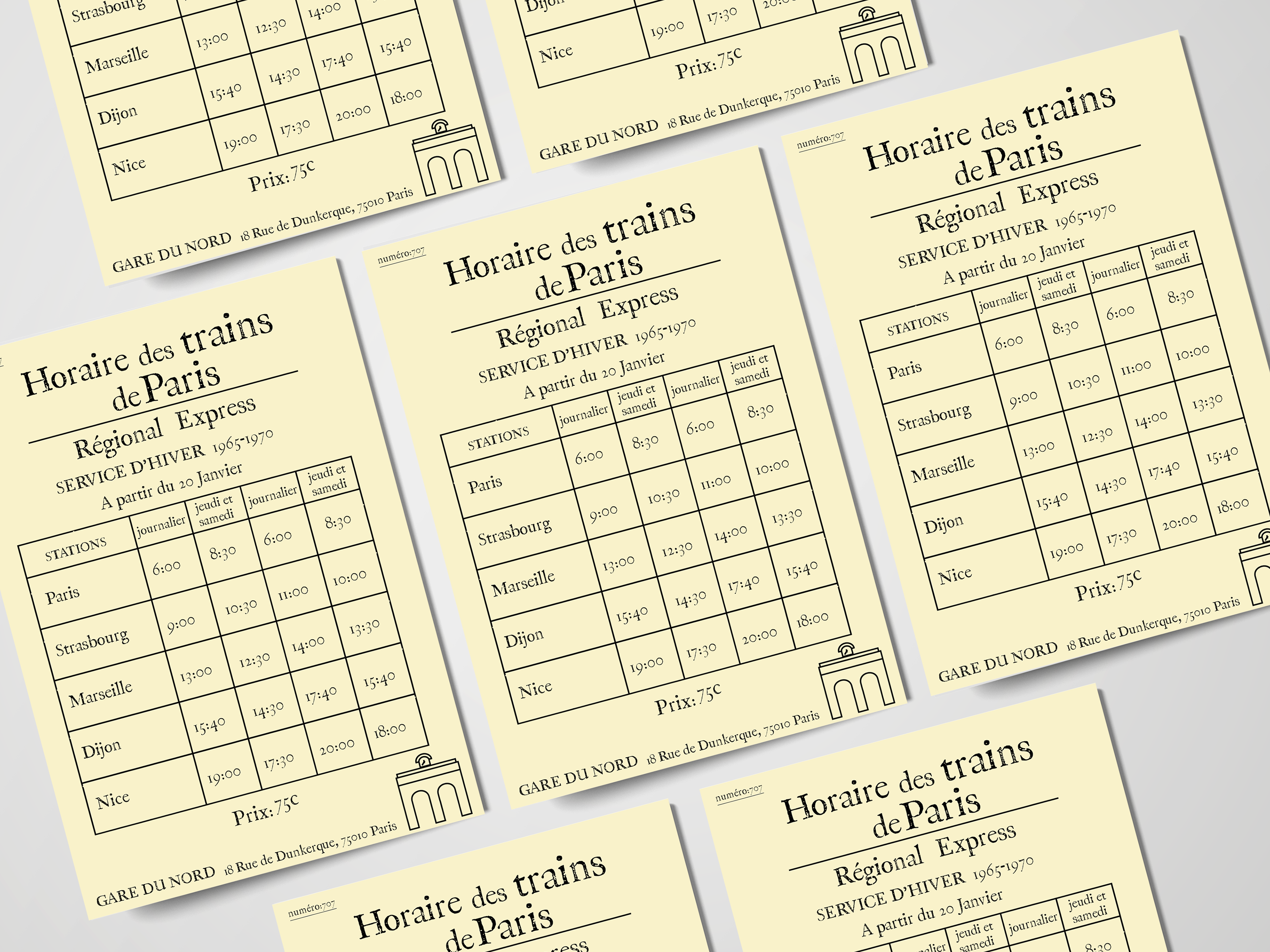
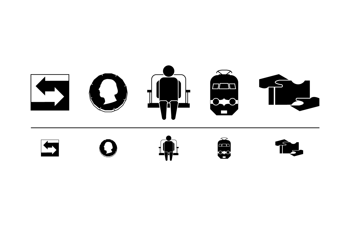
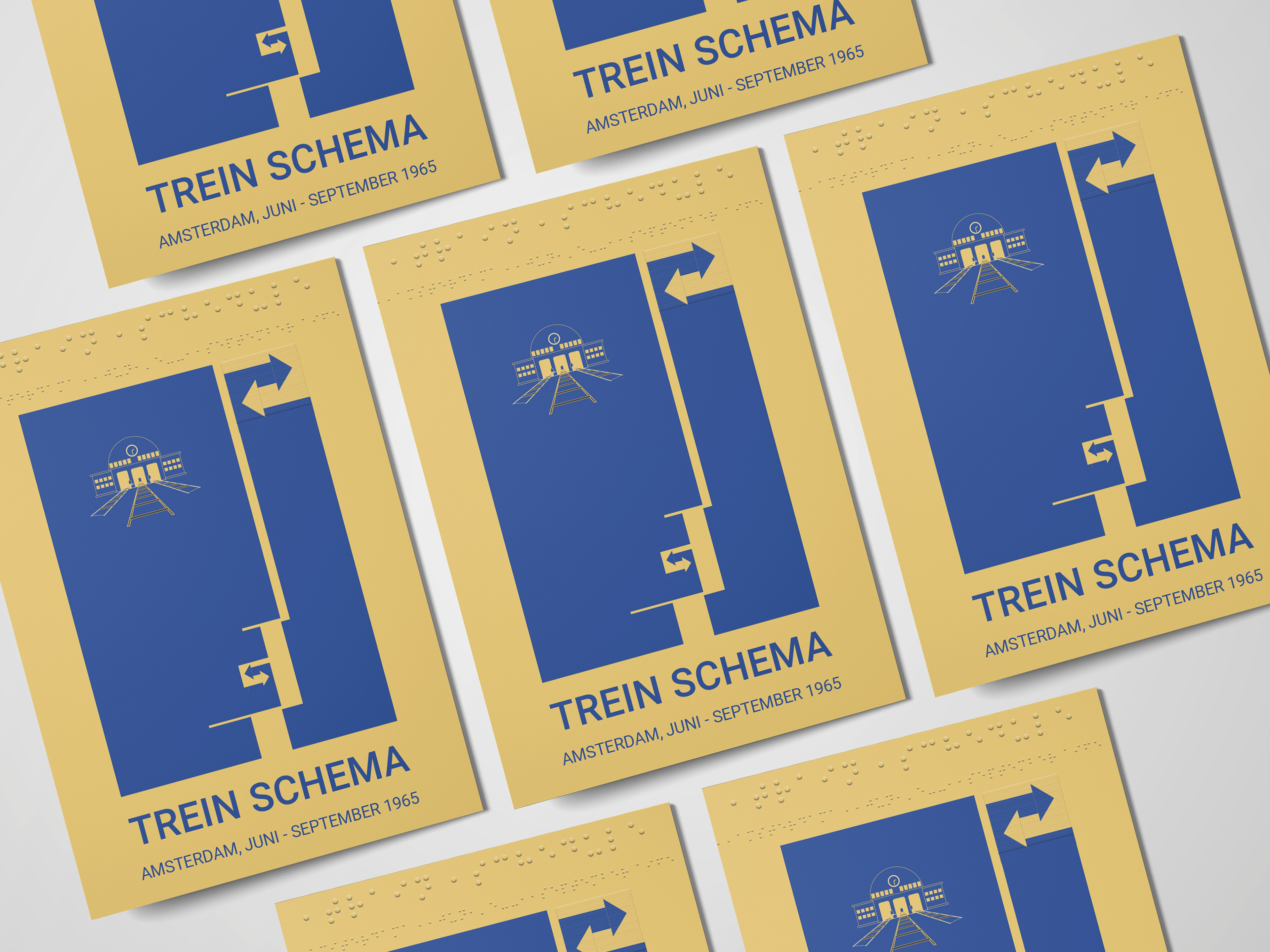
Labros Georgiou / 1965 / Netherlands
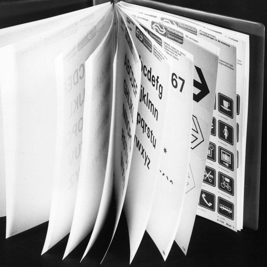
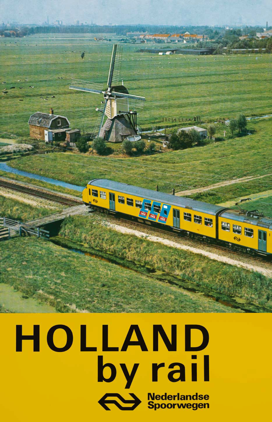
The main idea around the design of the symbols is based on the Dutch design of 1965. Netherlands, a flourishing country in arts, from the 17th century (Dutch Golden Age Painting), became world famous for their design in 70s. A point is that Netherlands was the first country in Europe that implement the modern corporate national design, in 1968.I tried to make the symbols similar to each other in terms of visual language. I considered it important to differentiate completely in terms of point of view so that they are more easily distinguished as signs in the space. The color nuance in the cover page has been selected to avoid it’s aggressiveness by making it a “warm yellow”. Yellow also provides a striking contrast in the landscape. It endorses the statement: “Here it comes”.
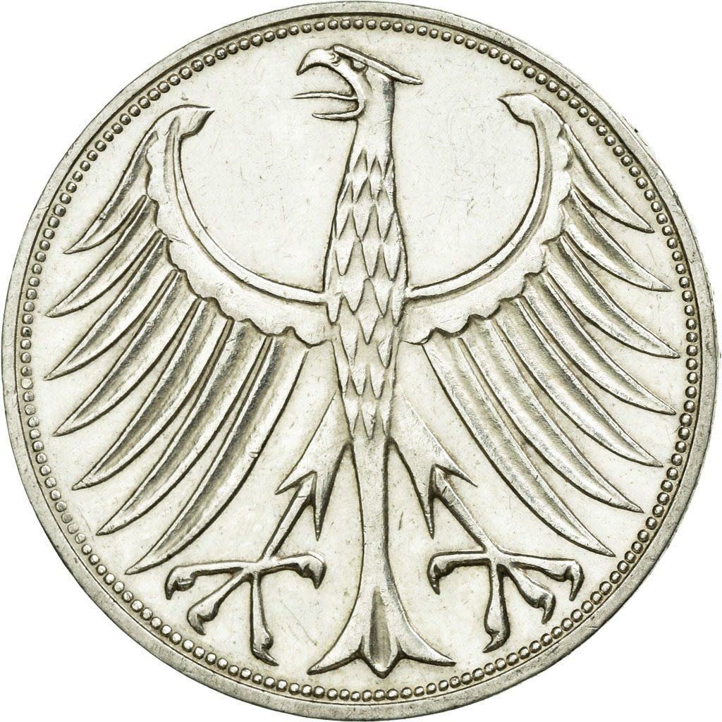
Panagiotis Zamanis / 1970 / W. Germany

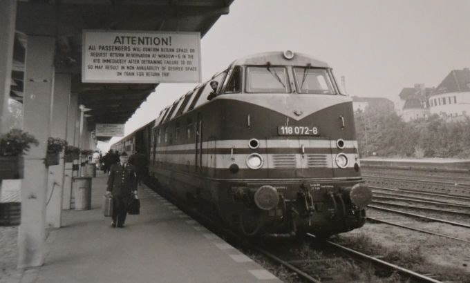
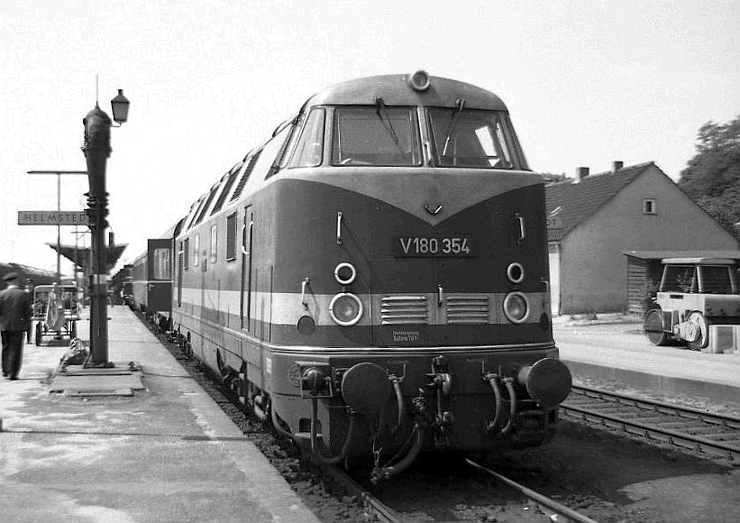
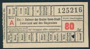
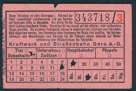
Deutsche Bundesbahn
German Federal Railway
The first task for the DB was rebuilding the damage done to the network during the war. West Germany was not subject to war reparations, so the influx of capital made reconstruction a lot easier than in the east. New stock was built, and railbus services increased to stave off competition from motor transport. With increased electrification steam was phased out by 1966-1977.

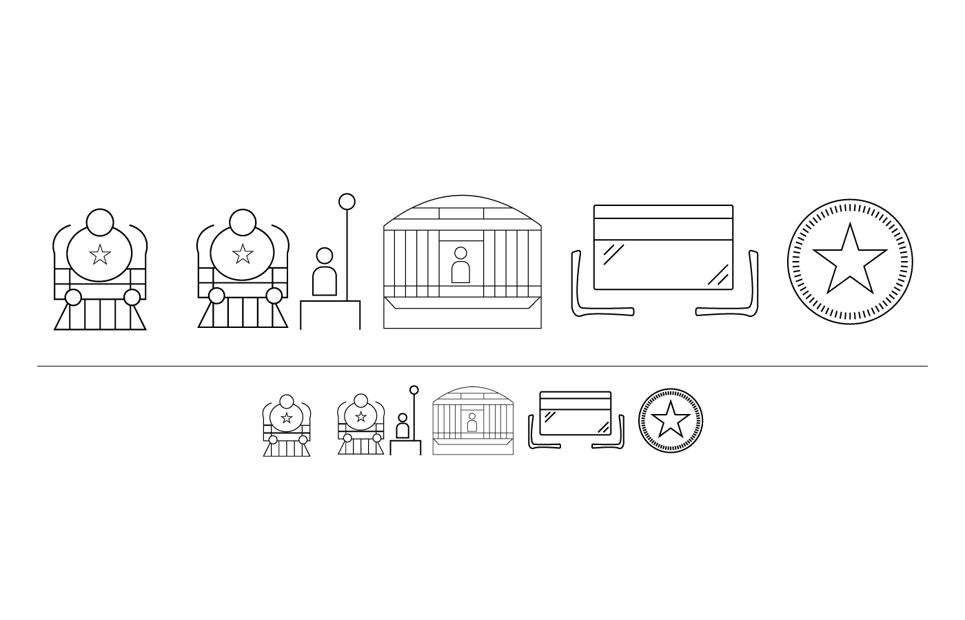
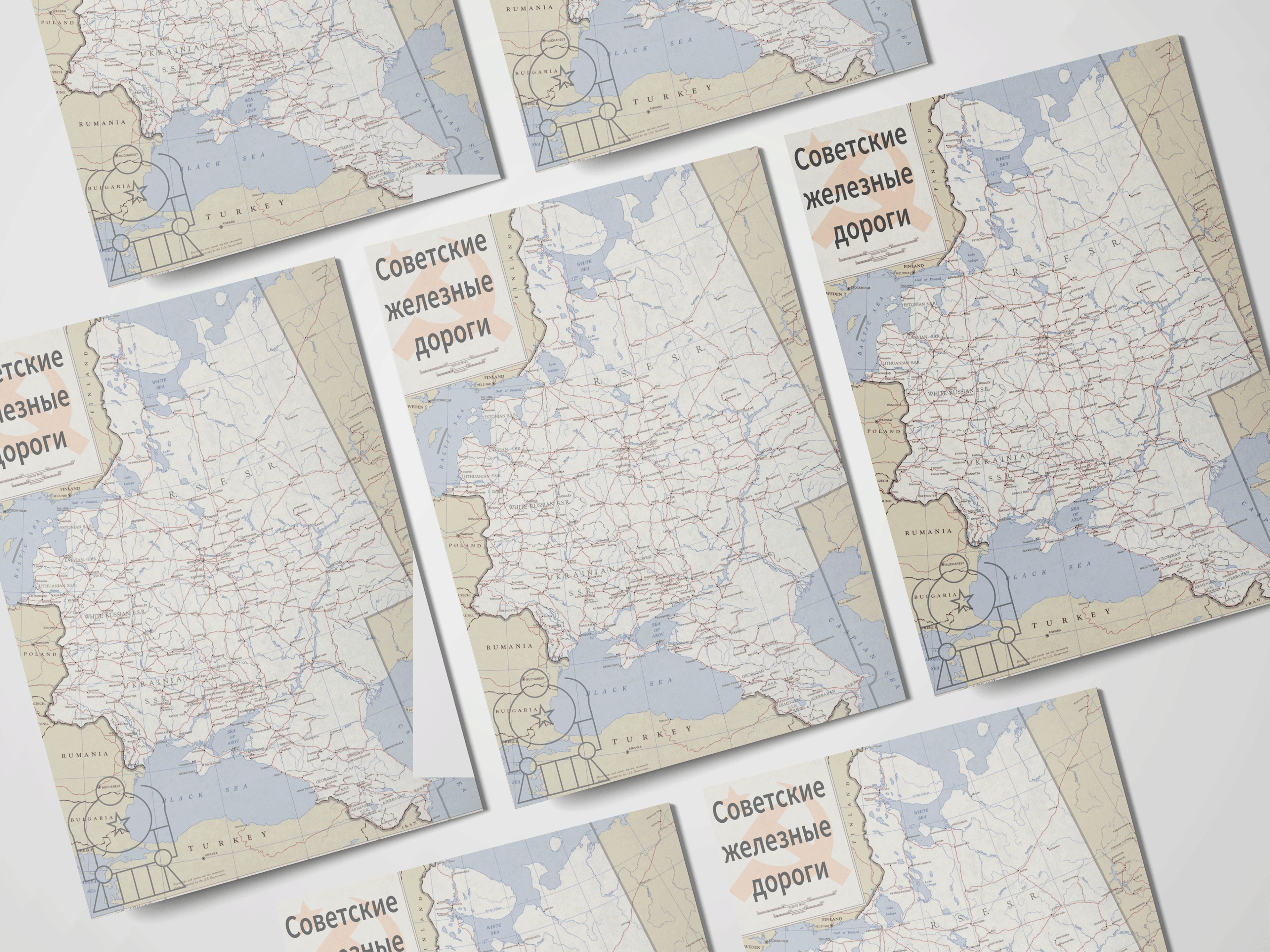
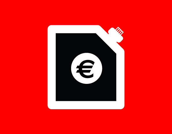
Demi Panagou / 1985 / Soviet Union
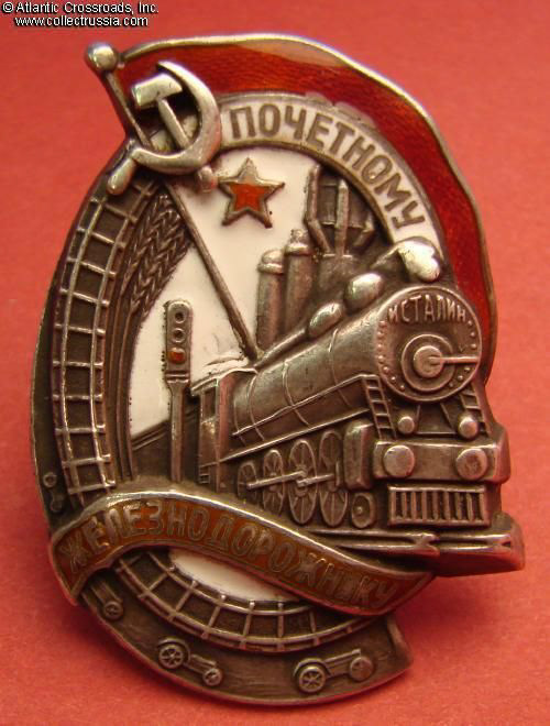
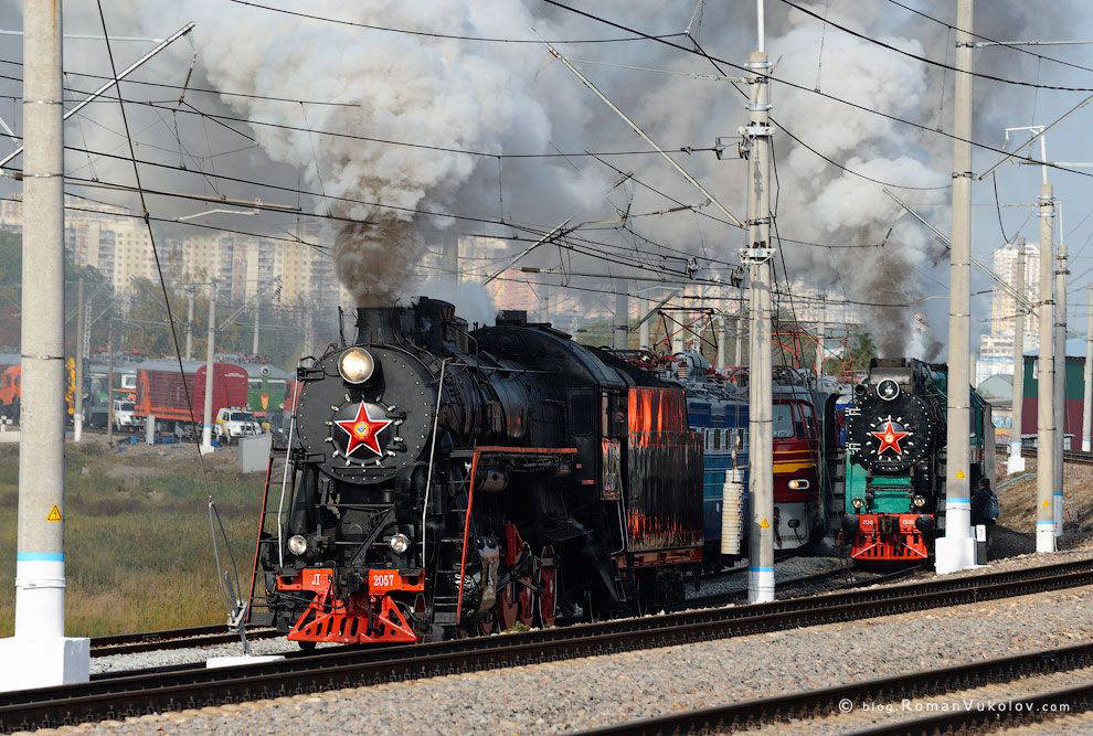
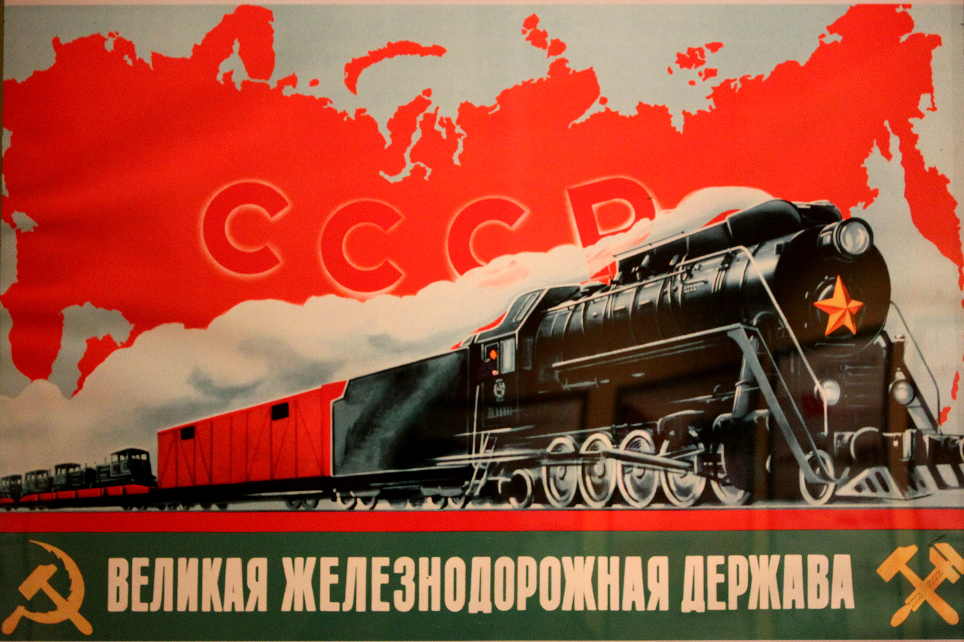

The Soviet Railways was the state owned national railway system of the Soviet Union, headquartered in Moscow. The railway started operations in December 1922, shortly after the formation of the Soviet Union. It operated until the dissolution of the Soviet Union in December 1991. The Soviet Railways were the largest unified railway in the world and the backbone of the Soviet Union's economy. Soviet Railways greatly upgraded and expanded the Russian Imperial Railways to meet the demands of the Soviet Union. The railway was directly under the control of the Ministry of Railways in the Soviet Union.